Design Systems: What They Are and Why You Need One

WDG’s designers and developers are experts in design systems. They are fundamental to our web process and central to collaboration between our designers and developers. We implement them on every web engagement, regardless of size. And while the breadth and depth may vary between projects, our commitment to incorporating design systems into our design and development process remains constant.
What are Design Systems?
Design systems are not a new concept in website design and development. They have been an essential part of the web building process going back to the late 2000s. For nearly two decades organizations of all sizes have been redesigning their websites to take advantage of the latest technologies that make them more mobile friendly, accessible, and easier to manage. Having a state-of-the-art, open-source content management system (CMS) is a must in this scenario. Once designed, built and delivered, CMS-powered websites can be handed over to in-house teams to manage their own web presence with a lot less reliance on outside vendors for content updates.
As websites grew ever more modular and CMS-driven, teams needed a reliable way to keep design integrity intact. Design systems emerged as that solution. They provided a means for bridging design and development with shared rules, reusable components, and a unified visual language.
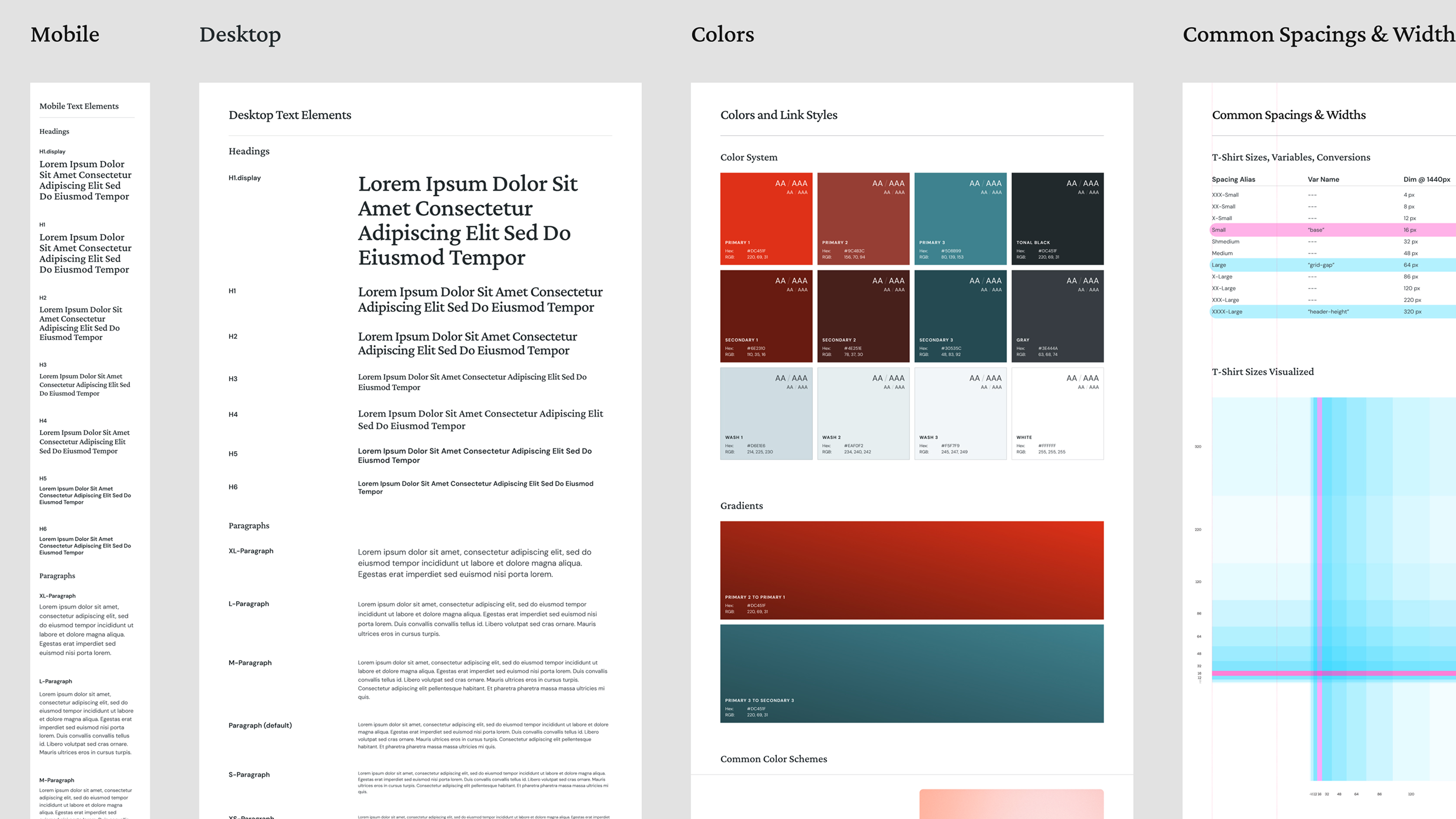
At WDG, design systems are crucial to our design and build process. They keep our website project teams in sync. Compiled and refined over the course of an engagement, they are the culmination of every decision point we make with the client along the way; from strategy and UX decisions to brand, UI, and functional behaviors. They can be exhaustive in their detail, with visual and annotated descriptions of all of the elements that make up a website, making them a much valued resource for our developers as they navigate the build process.
Design at an Atomic Level
Brad Frost coined the idea of atomic design over 10 years ago to describe the importance of working with design systems for modern websites. In his book by the same name, Frost dug deep into a chemistry analogy to illustrate his point. The gist: the components that make up the entirety of a web system can be distilled down into a basic set of UI “elements” that can be combined and recombined in different ways to create ever more complex “compounds” which are the components, patterns and templates used for building web pages. On its surface, atomic design is all about modularity. Even further, it’s the idea that the integrity of each part in a system of parts has an outsized impact on the integrity of the whole.
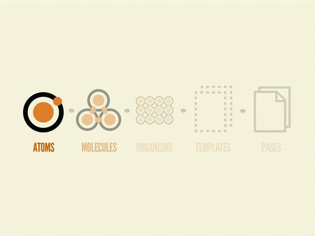
WDG’s project teams embrace this methodology whole-heartedly. Our entire web building process centers around novel modular design principles that feature flexible systems of repeatable elements, components and layout patterns. We find this approach couples nicely with website redesigns that feature a robust and flexible CMS like WordPress, our go-to CMS.
Where to Begin? With Figma, Of Course!
Our design systems live in Figma—our principal collaboration and design tool of choice. Our project teams generate all aspects of our UX and design deliverables in Figma. And all team members—and even clients—have access to the same working file, to the point that we can be editing the same designs at the same time, or follow along while someone demos a new feature.
With Figma, our strategists, designers, developers, and project managers have a synchronized, 360° perspective of everything that is produced over the course of the project. This makes Figma a perfect home for our design systems; a single source of truth, published in real time and available to all as a collaboration point and design reference.
The Design is in the Details
Our designers first task on a website redesign is to establish the design direction. This is accomplished through different exercises involving collaborative workshops with the client and independent design exploration. Our first outputs are what we refer to as stylescapes; contextully loose but visually committed collections of brand and UI elements that establish the design direction, or look/feel for the engagement. Learn more more about our web design and development process from WDG’s creative director, Dario Tadić
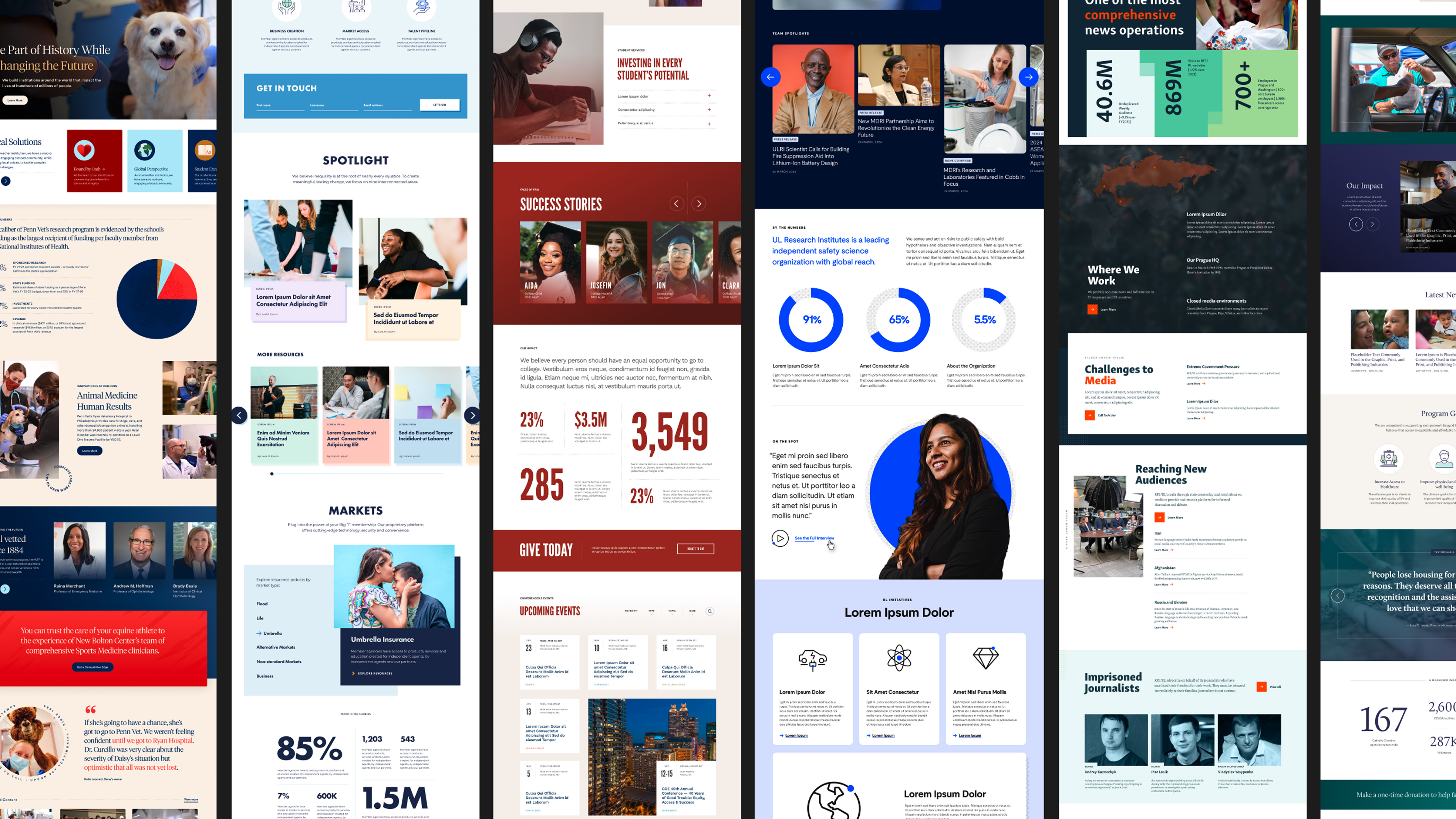
The center piece of our stylescapes are often the most basic building blocks of web pages–text treatments, colors, UI elements, button styles—that will form the foundation of our design system. We work piece by piece, or atom by atom, to create an expanding set of design components with an increasingly complex tapestry of design rules dictating how they fit together.
Our base elements are mixed, matched, shaped and reshaped into more complex content components that comprise the constituent parts of web pages—header, footer, navigation components, content feature blocks, article listings, etc. By the time our strategists are putting the finishing touches on their information architecture and wireframe documents, our designers are poised to leverage the design system to roll through the page design process and speed the engagement into development with a happy client coming along for the ride.

Learn how we created a Design System for The Aspen Institute
A modern digital ecosystem connecting leaders, ideas, and global impact.
The End is Just the Beginning
With the bulk of the design process complete, the work that remains is to document all of the aspects of the design information that are crucial to development. Thanks in equal parts to our design approach and the dev-centric workflows that Figma makes possible, by the time we get to the end of the page design process, we have nearly all of the design system information compiled, outlined, annotated, and dev-ready.
But it doesn’t always stop there. If we did our job right, all of that design information can live on as an important reference document for client-side teams. Much in the same way that it served as the blueprint for the initial build, it can inform the direction for future site enhancements for years to come.
Building for Consistency, Flexibility, and the Future
Design systems are much more than a design artifact. They’re the connective tissue between creative vision and technical execution. They allow designers and developers to speak the same language, ensure consistency across every screen and device, and create a framework that supports growth long after launch.
At WDG, our design systems evolve in tandem with each project. They are living frameworks that grow from early conceptual explorations into fully realized design libraries, shaping how our teams think, design, and build. When a system is built right, it gives our clients confidence that their digital experience will not only look cohesive, but perform consistently across every page and interaction.
Design systems are powerful because they bring together the best of design craft, engineering precision, and content flexibility. They:
- Unify teams by providing a single source of truth for all design and development decisions.
- Increase efficiency by enabling faster iterations, fewer redundancies, and cleaner handoffs between design and code.
- Ensure scalability by allowing new pages, modules, and features to be added without breaking consistency.
- Reinforce brand integrity by maintaining alignment across every digital touchpoint.
- Empower clients to manage, update, and expand their web presence confidently through structured, reusable design components.
In a world where technology and user expectations evolve rapidly, design systems serve as both a blueprint and a compass. They help teams build faster, collaborate better, and deliver experiences that are timeless, accessible, and future-ready. At WDG, design systems aren’t just a step in our process, they are the process. They define how we translate ideas into intuitive, scalable digital experiences built to last.
Related Insights