4 Elements of an Effective Landing Page
A website’s landing page is like a first impression: it’s your chance to demonstrate the value of a product or service in a way that builds excitement and drives engagement. There is no definite rule-book on how to build the perfect page. Oftentimes, the needs of your company and what it offers will not always translate the same way another company’s needs do.
What can be distilled down and made universal, however, are four principles that will help make any landing page more effective for your users.
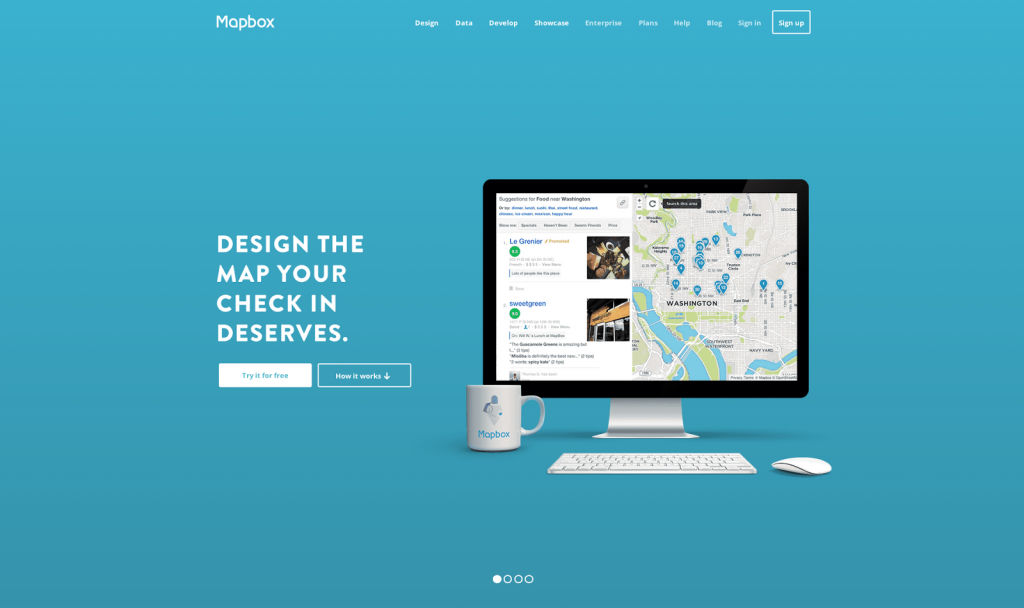
Open With Obviousness


Highlight the Best Bits, and Resist Over-Explanation
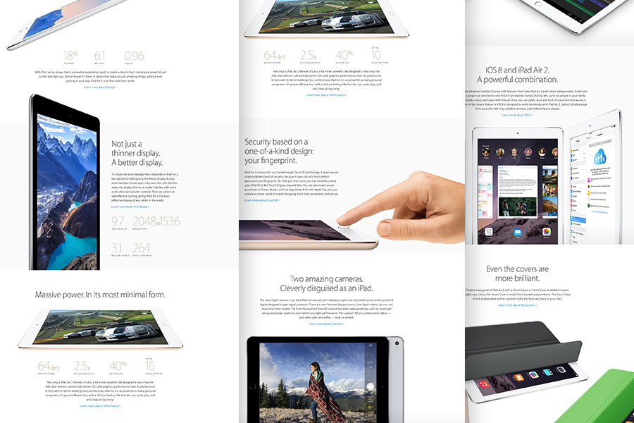
Your product is awesome. You’ve put so much work into it; you could gush about it for days. But you have to remember that conciseness is key. Apple, for instance, does a great job with all of their product overviews by creating what I refer to as “skim-friendly pages,” which are pages you can quickly scroll down, only read the headlines, and still feel like you have a good sense of what’s interesting about the product. This method to content is also great, because it offers multiple entry ways for visitors to understand your product and dive into aspects that are most interesting to them.
When writing all the copy for your page, resist the urge to over-explain. Brevity is key. If you want to highlight a feature, say what makes it great and allow a secondary page on the inside to further expand on the nuts and bolts.

Supporting Images/Demonstrations of Product
No matter how excellent your written copy may be, it’s hard for customers–who are not quite convinced to buy into your product–to get interested if all you have is nice words. Your landing page is the first impression potential customers will have. Not only will you want clear content, but also accompanying visuals to build excitement around your product, set a mood, and demonstrate use-cases. Having visuals can significantly bolster your messaging and help users better understand your product.
For example: https://www.apple.com/macbook-pro/
Page Flow and Hierarchy
Now that you have your content, it’s time to assemble it in a way that is seamless and intuitive. There’s a fine balance to all pages on the web, especially ones with as much to prove as a landing page. It’s likely that some items on your page will be more important than others. Carefully giving the right amount of hierarchical weight and scale to everything you need to say will give users a smoother reading experience.
To make a weird analogy, the construction of a great landing page should be something like a well-done musical. It should open with an attention grabbing number, smoothly transition to the next highlight, and end with one last memorable piece. If every element on the page is equally loud, nothing gets highlighted. Be sure to pause and consider what needs to stand out on your page, and what secondary items still must be represented.
Have anymore questions about crafting functional and effective landing pages? The designers at WDG have got you covered. Get in touch with us today for information about starting a new project.