Website Design Without Images: How to Create Engaging, Effective Web Experiences Using Only Content
Visual design is often associated with photography, illustrations, and graphics — but a compelling website doesn’t require images to feel modern, polished, or effective. In fact, designing a website without images can result in a uniquely clean, high-performance, and content-driven experience. Whether the choice is strategic (minimalism, accessibility), practical (no available assets), or required (policy restrictions, legal constraints), image-free design is not a limitation. It’s an approach that demands clarity, intention, and strong structural decisions.
At Web Development Group (WDG), we’ve built websites that succeed without relying on photography or decorative imagery. When visuals take a back seat, content clarity, layout, hierarchy, and user experience take center stage, which often leads to better readability, faster load times, and a more equitable experience for all users.
This guide walks through how to design a website without images while still achieving personality, visual appeal, and usability.
Key Takeaways
- Image-free websites rely on strong layout, hierarchy, and structural clarity to create engagement.
- Color, whitespace, and UI components can replace the visual impact normally provided by imagery.
- Content strategy becomes more important, and messaging carries more weight when users rely solely on text.
- Accessibility naturally improves in image-free design, but still requires active consideration.
- WDG helps organizations build content-forward websites that feel polished, branded, and user-centered without relying on images.
Why Design a Website Without Images?
While images can enhance a digital experience, there are many valid reasons to build a website without them. Some organizations lack photography resources. Others work within strict compliance or privacy constraints. Some projects intentionally pursue a minimalist aesthetic. And sometimes, removing images is simply the most practical way to improve performance and accessibility.
Common reasons include:
- Improved performance: No images means dramatically faster load times.
- Accessibility-first design: Users relying on screen readers or low-vision tools benefit from content not dependent on visuals.
- Minimalist branding: Some brands embrace clarity and simplicity over decoration.
- Security or legal policies: Certain industries cannot show photos of people, facilities, or client work.
- Content-driven goals: Some websites prioritize writing, data, or structured content instead of visuals.
Whatever the reason, designing without images challenges teams to be more intentional with structure, messaging, color, and UX, resulting in cleaner, more effective digital experiences.
How to Build a Visually Engaging Website Without Images
Designing without imagery doesn’t mean sacrificing style or personality. It means elevating foundational design elements that often take second place behind visuals. When executed well, these elements work together to create a focused, high-quality experience.
1. Strengthen Layout and Hierarchy
When you remove imagery, layout becomes your primary design tool. Hierarchy guides users through the page and helps them understand what matters most.
Best practices include:
- Clear sectioning: Use spacing, dividers, and consistent formatting to guide the eye.
- Structured content flow: Begin with scannable headers, followed by short text blocks and clear CTAs.
- A deliberate grid: A strong grid system creates predictability and order when imagery isn’t available to break up content.
- Logical sequencing: Introduce information in layers, moving from high-level to more detailed content.
Strong layout doesn’t just make image-free pages look good; it ensures users can navigate and understand content effortlessly.
2. Leverage Color and Contrast for Visual Interest
Color is one of the most powerful tools in image-free design. When used purposefully, it creates depth, divides content, and draws attention.
Ways to apply color effectively:
- Contrast between sections: Alternate light and dark backgrounds to establish flow.
- Use accent colors sparingly: Apply brand colors to headings, buttons, and callouts to create visual rhythm.
- Color-coded systems: Use consistent color rules for categories or content types.
- Accessibility check: Ensure contrast ratios support readability and inclusivity.
Color, when applied with intention, becomes the new “visual anchor” in the absence of images.
3. Use Iconography and Simple Shapes (If Allowed)
If your image-free rules allow for non-photographic elements, icons, shapes, and basic graphic components can add structure and enhance clarity without feeling decorative.
These elements work well for:
- Highlighting features or benefits
- Improving scannability in lists
- Supporting navigation and orientation
- Adding subtle visual balance on dense pages
Keep iconography simple, consistent, and purposeful; overuse can make layouts feel cluttered.
4. Elevate Content Strategy and Microcopy
Without visuals, content must communicate with more precision and clarity. The words you choose — and how you structure them — become central to the user experience.
Content best practices include:
- Strong, descriptive headings: Help users understand what each section is about at a glance.
- Short paragraphs: Break content into digestible sections for readability.
- Contextual microcopy: Use supportive text near CTAs, forms, or interactive elements to reassure or clarify.
- Benefit-first messaging: Focus on value, not features.
Good writing becomes a visual element in itself when structured effectively.
5. Use UI Components to Create Structure and Visual Texture
Well-designed components can replace the visual depth typically provided by images. Components add rhythm and create visual interest through variations in shape, function, and interaction.
Examples include:
- Cards with subtle borders or shading
- Highlight boxes for quotes or callouts
- Tabs and accordions to break up content
- Vertical rules or section dividers
- Stylized CTA blocks
This approach is especially effective in component-driven design systems.
6. Incorporate Thoughtful Animation and Micro-Interactions
Motion can guide attention, provide cues, and create delight — all without relying on photography or illustration.
Examples of useful motion:
- Subtle hover states on buttons or cards
- Accordion slide animations to reveal content
- Fade-ins that help pace content delivery
- Form field highlights to indicate active focus
The goal is to use animation functionally, not gratuitously, reinforcing hierarchy and usability.
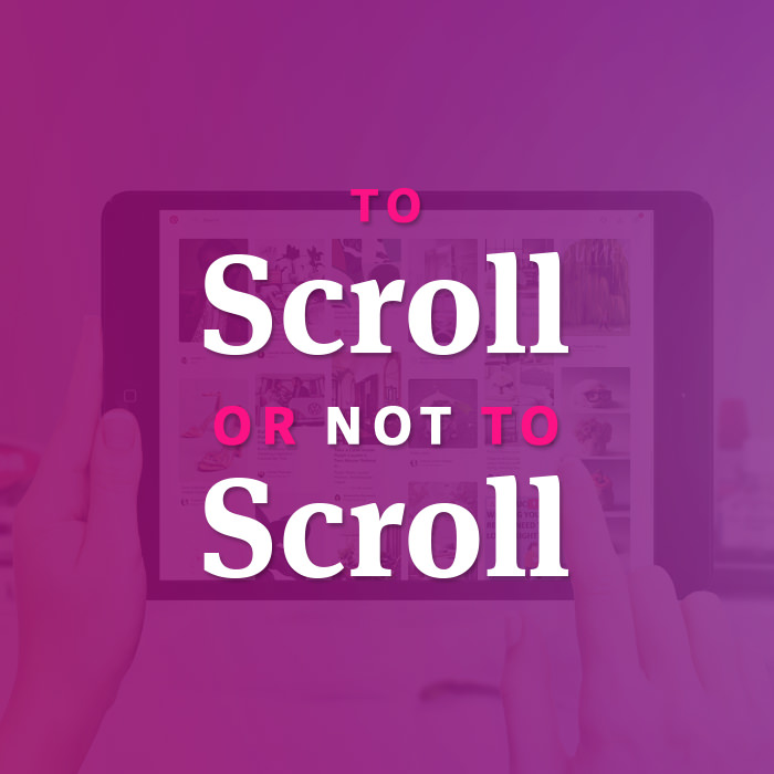
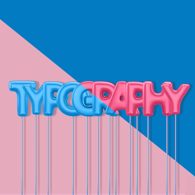
7. Use Strong Typography (But Don’t Let It Become a Crutch)
Typography is essential in image-free design, but it should complement the experience rather than dominate it. Strong type choices support hierarchy, readability, and brand personality.
Guidance includes:
- Keep headline and body contrasts clear — weight, size, and spacing should differentiate content without overwhelming users.
- Use type to reinforce structure — consistent spacing between headings, paragraphs, lists, and components signals order.
- Avoid overly decorative fonts — clarity should always win.
- Limit font families to maintain consistency and reduce distractions.
Typography helps create visual appeal, as long as it’s used deliberately and with restraint.
How to Ensure a Positive User Experience Without Images
User experience becomes even more important when imagery is removed. The structure and clarity of the site must do more of the communication work, making UX decisions highly influential.
Key principles:
- Clean, intuitive navigation paths: Users should be able to find content without guessing.
- Readable content patterns: Use section headers, summaries, and bulleted lists to break up long text.
- Predictable patterns: Maintain consistency between sections so users understand how to move through the site.
- Ample spacing: Whitespace becomes a design asset, improving focus and reducing fatigue.
When UX is prioritized, users hardly notice the absence of images — the experience feels natural and easy.
How to Maintain Branding Without Imagery
A website can feel deeply branded without relying on photography. Brand identity is expressed through the systems that hold the content together.
Branding approaches include:
- Color palette: Strong, consistent use of brand colors creates cohesion and memorability.
- Consistent typography: Fonts can express tone — sophisticated, modern, traditional, playful — without imagery.
- Voice and tone: Content becomes a brand asset when written with personality and intention.
- Structural personality: Bold layouts, precise grids, or minimalist spacing can signal brand values just as much as photos can.
- Logo and micro-patterns: Subtle background textures or line elements (if permitted) can reinforce brand identity.
Image-free branding focuses on clarity and consistency more than visual ornamentation.
Accessibility Advantages of Image-Free Design
Designing without images naturally removes some of the most common accessibility challenges — but it still requires care and testing.
Major advantages include:
- No reliance on alt text: Eliminates the risk of missing or unhelpful descriptions.
- Reduced cognitive load: Neurodivergent and low-vision users benefit from simpler layouts.
- Smaller file sizes: Faster load speeds help users on slow networks or older devices.
- Less visual noise: Users who prefer text-first experiences find image-free sites easier to parse.
However, designers must remain mindful of color contrast, text legibility, keyboard navigation, and clear hierarchy to ensure full accessibility compliance.
Related: What is Web Accessibility?
Common Mistakes in Image-Free Web Design
Avoiding these pitfalls helps ensure that a minimal approach still feels polished and intentional.
- Over-Styling Typography: Using excessive weights, sizes, or decorative fonts as a substitute for images can make the site feel chaotic and harder to read.
- Creating Dense Walls of Text: Without images, breaking content into digestible pieces becomes even more important.
- Overusing Color or Patterns: Trying to compensate for missing visuals with loud colors or multiple patterns can overwhelm users.
- Lack of Section Definition: Users should always understand where one idea ends and another begins — spacing, rules, and headers are essential.
- Assuming “no images” means “no visual design”: The absence of imagery makes layout, spacing, and micro-interactions more important, not less.
Partnering with WDG for Content-Forward Web Design
Designing a website without images requires clarity, creativity, and a deep understanding of content-driven UX. At WDG, we specialize in building digital experiences where layout, structure, and messaging work together to create compelling, engaging websites — even in the absence of photography or illustration.
Our team blends content strategy, UX best practices, accessibility standards, and modern front-end development to help organizations communicate effectively using only the essential tools of design. Whether you’re intentionally pursuing a minimalist approach or working within constraints, WDG can help you build a site that is timeless, readable, fast, and thoroughly on-brand.
If your organization is exploring text-first or image-free design, we’d be happy to guide you through the process and help bring your vision to life. Contact us today to get started!
FAQs about Designing a Website Without Images
Can a website be visually appealing without images?
Absolutely. With the right layout, color system, and content structure, image-free designs can feel modern, clean, and engaging.
What replaces images in this type of design?
Components, color, typography, motion, spacing, and content hierarchy take on roles traditionally filled by imagery.
Is image-free design good for SEO?
It can be. Faster load times and reduced bloat improve both technical SEO and user experience — as long as content remains structured and keyword-friendly. But note that you will miss the SEO benefit of image alt text.
Can image-free websites still reflect brand identity?
Definitely. Brand identity comes through layout, color, typography, voice, and interaction patterns — not images alone.