Color Theory in Web Design and Digital Experiences
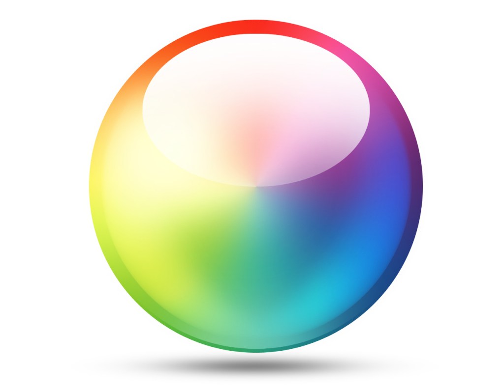
Color does more than decorate a website — it directs attention, evokes emotion, and influences user behavior. In digital design, color isn’t just aesthetic; it’s strategic. The right color palette can build trust, communicate a message instantly, and even improve conversion rates.
At Web Development Group (WDG), color theory is a cornerstone of our design philosophy. Our designers are experts in pairing hues, balancing tones, and creating visual harmony that enhances usability and emotional connection. According to WDG designer Kristina, “Complementary, analogous, and triad colors are your best bet. With that said, don’t use all the colors on the wheel. I usually stick with a maximum of three different colors, and you can have as many shades, tints, and tones of one color as you’d like.”
By applying color theory with precision and purpose, WDG builds websites that look beautiful, feel intuitive, and perform flawlessly.
Key Takeaways
- Color theory in web design connects visual design, psychology, and usability.
- Strategic color selection influences emotion, perception, and conversion.
- WDG uses research-based methods to balance complementary, neutral, and bold tones.
- Color choices affect accessibility, audience engagement, and brand recognition.
- Testing color distribution across headlines, CTAs, and accents ensures both beauty and performance.
What Is Color Theory in Web Design?
At its core, color theory is the science of how colors interact and how those interactions influence perception. In web design, it guides everything from branding and layout to usability and mood.
A well-applied color scheme helps users intuitively understand hierarchy, navigate content easily, and feel emotionally connected to a brand. Designers rely on principles such as:
- Primary, secondary, and tertiary colors: The foundation of every color palette.
- Complementary, analogous, and triadic color schemes: Systems that balance harmony and contrast.
- Hue, shade, tint, and tone: Variations that add depth and flexibility within a palette.
At WDG, these principles guide every design decision. The goal isn’t to fill a page with color — it’s to use the right colors, in the right way, to communicate clearly and consistently.
The Psychology of Color in Web Design
Color influences emotion before users even read a word. It sets the tone, shapes perception, and drives response. Designers use color psychology to create visual environments that support a brand’s message and encourage user action.
Here’s how colors typically influence perception:
- Red: Urgency, passion, and attention — often used for CTAs or alerts.
- Orange: Energy, friendliness, and creativity.
- Yellow: Optimism, clarity, and warmth.
- Green: Growth, stability, and calm.
- Blue: Trust, professionalism, and reliability.
- Purple: Creativity, luxury, and imagination.
- Black/Gray: Sophistication, balance, and neutrality.
Color psychology isn’t universal — it must align with audience expectations and brand identity. WDG’s designers craft palettes that evoke specific emotions and ensure visual consistency across every touchpoint.
Designing Websites with Strategic Color Balance
At The Web Development Group, our designers are experts in color pairing, balance, shading, and tinting. We know how to offset bright colors with neutrals and complement bold hues with subtle tones. Every color we choose serves a purpose — to guide the eye, create hierarchy, and enhance usability.
Every element is tested to ensure the best color distribution across headlines, buttons, links, and accents. For example, research shows that high-converting call-to-action (CTA) colors tend to be bright primary or secondary shades — such as red, yellow, orange, and green. Darker or more muted tones like black, gray, or brown typically convert less effectively.
However, effective color application isn’t one-size-fits-all. We consider brand personality, contrast needs, and audience behavior before finalizing any palette.
“Design is about balance,” says Kristina. “Every bold color should have a neutral counterpart, and every accent should exist for a reason.”
This philosophy ensures WDG websites are not only visually stunning but strategically designed to engage users at every level.
Applying Color to Calls-to-Action
Color can make or break a call-to-action. A CTA that blends into the background is easily ignored, while one that contrasts effectively grabs attention without overwhelming the design.
At WDG, CTA colors are chosen based on their visual hierarchy and psychological impact. Warm, saturated hues like red and orange draw the eye and encourage action—cool tones like blue and green work best for reinforcing trust and consistency.
Our team often uses A/B testing to measure which color variations drive engagement for each client’s audience — ensuring design decisions are always backed by data.
Considering Audience and Accessibility in Color Selection
Color preferences and visibility vary across audiences. What feels fresh and modern to one demographic might feel overwhelming or inaccessible to another. That’s why every color decision at WDG accounts for audience behavior and accessibility standards.
For example:
- Gender: Research shows women often respond positively to purple, while men do not.
- Age: Seniors benefit from high-contrast designs with ample white space for readability.
- Demographics: Younger audiences gravitate toward bolder, more saturated palettes.
Accessibility is another key factor. All WDG designs are tested for WCAG contrast compliance to ensure text and elements are easily visible for users with visual impairments. Designers test multiple color combinations to confirm that accessibility never compromises aesthetic appeal.
Ultimately, color must not only appeal visually but also function inclusively.
Color Theory in Web Design and Development Collaboration
Applying color theory effectively requires collaboration between designers and developers. The two disciplines work hand-in-hand to ensure color choices remain consistent across devices, browsers, and operating systems.
At WDG, this collaboration begins early. Designers define the color palette, then developers ensure accurate implementation using hex, RGB, and variable color systems. Adjustments are tested for responsiveness, contrast, and dark-mode compatibility.
This cross-disciplinary approach ensures every WDG website maintains perfect color fidelity — from design mockups to final code — delivering consistency, accessibility, and brand integrity across the digital experience.
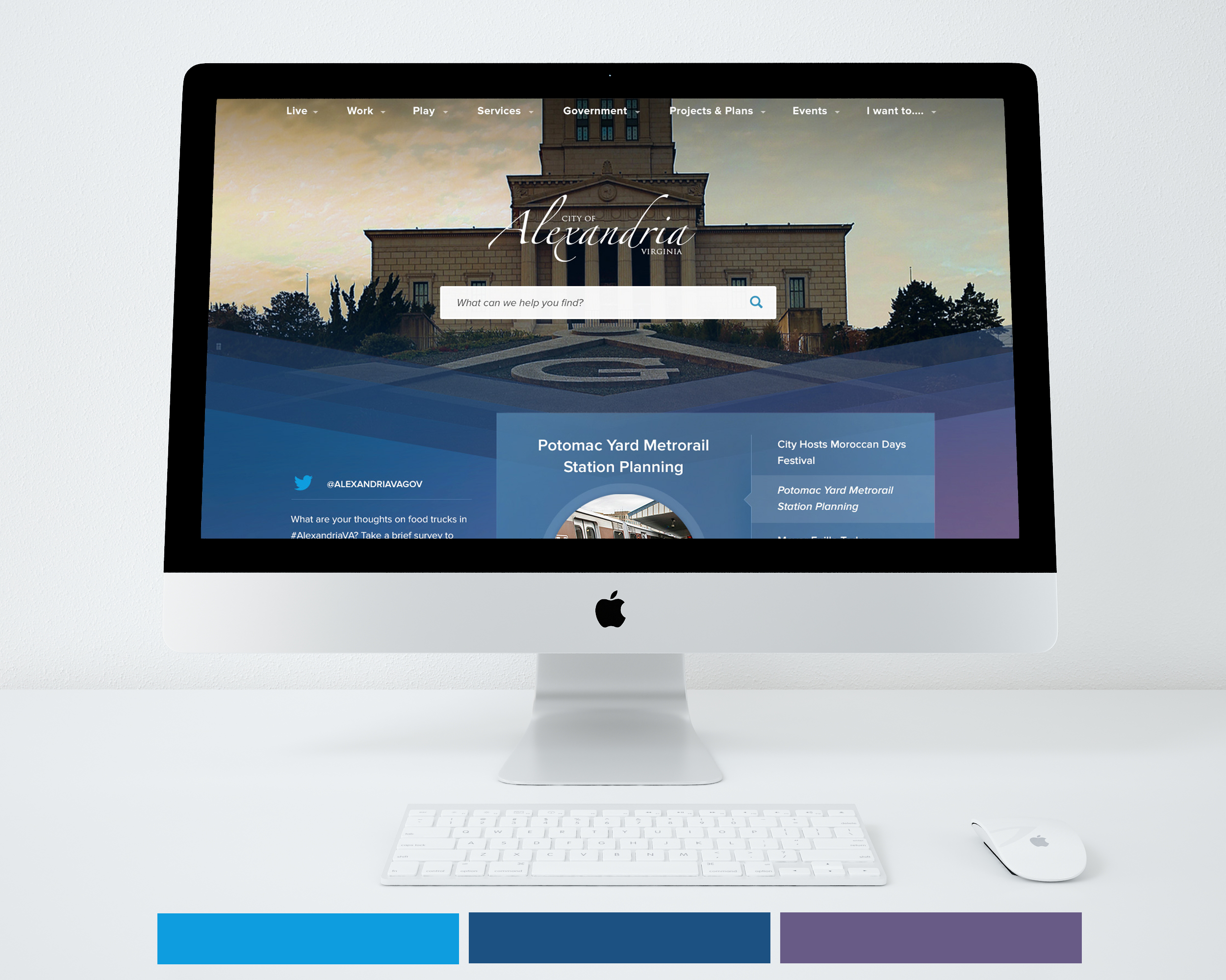
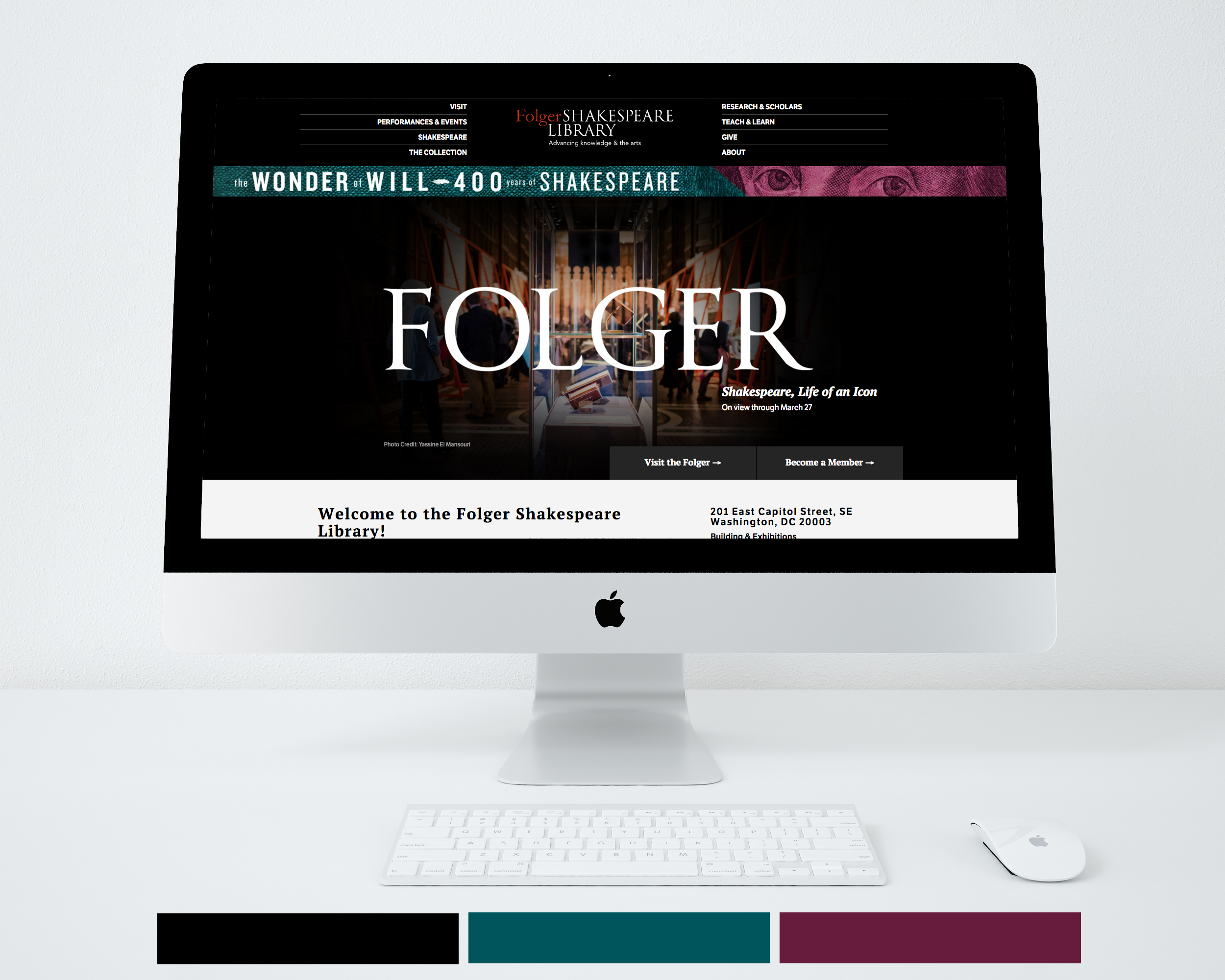
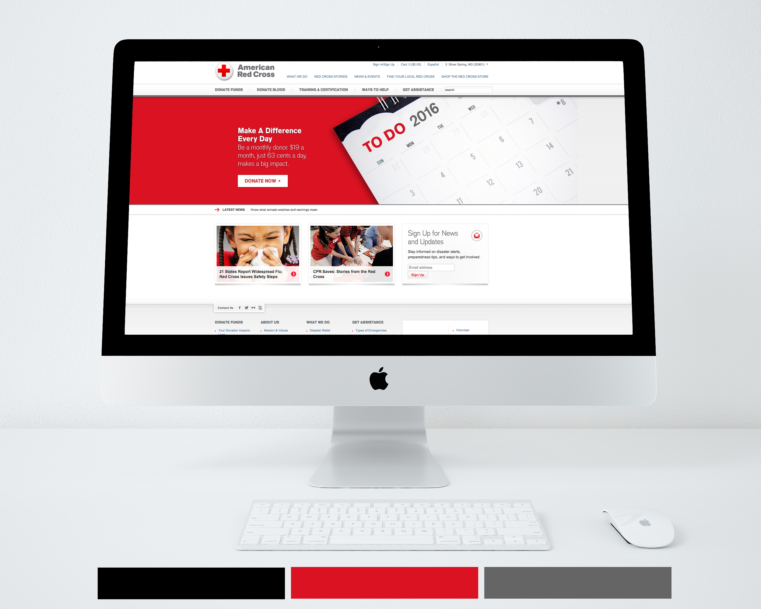
Examples of Successful WDG Sites that Utilize Color Theory
Blue. Use blue as a prominent color if you want your brand to convey Trust, Authority or Relaxation.
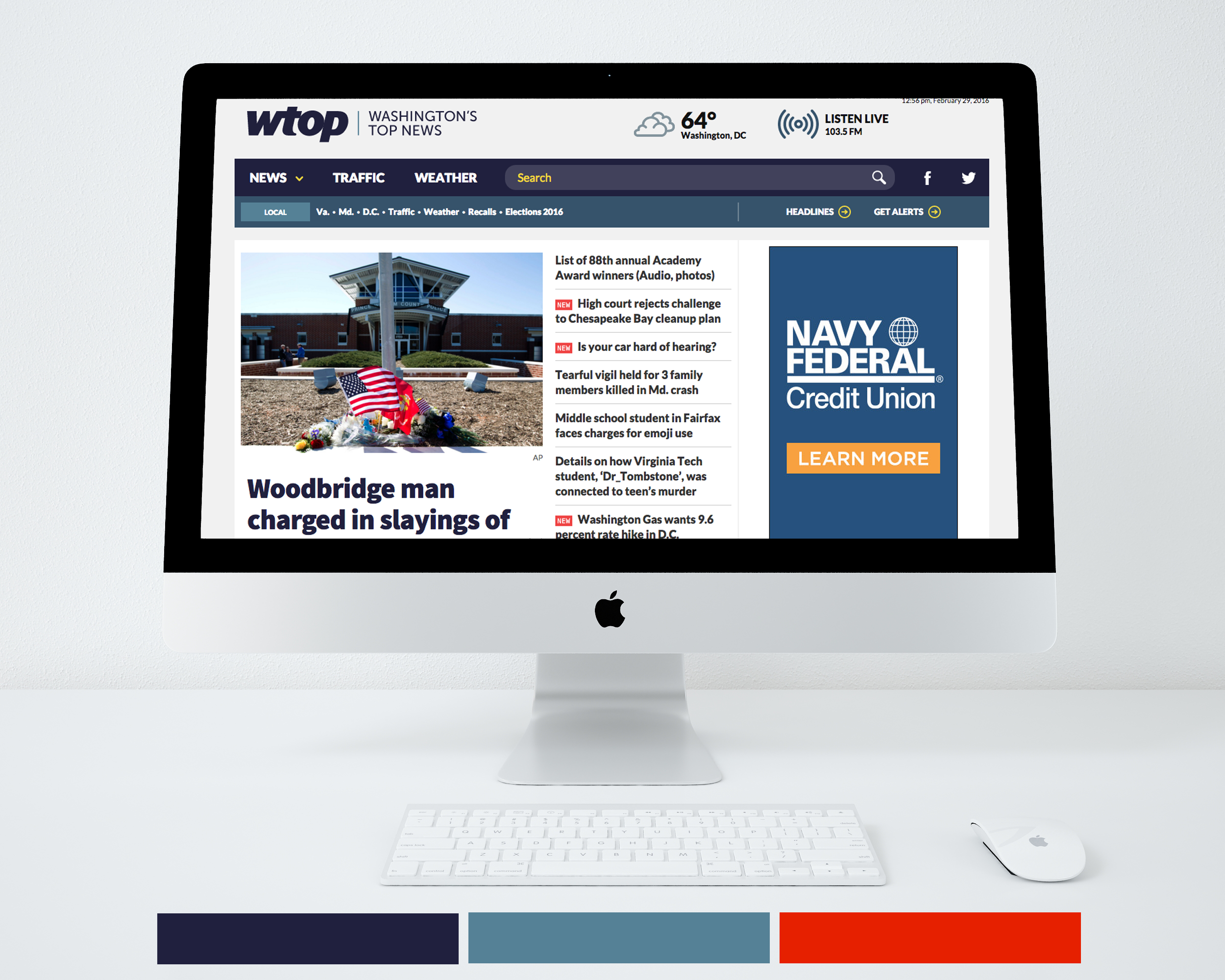

Black. Use black as a feature color if you want your brand to show Luxury, Power or Sophistication.
Orange. Highlight orange if you want your site to portray Fun, Youth or Incitement.
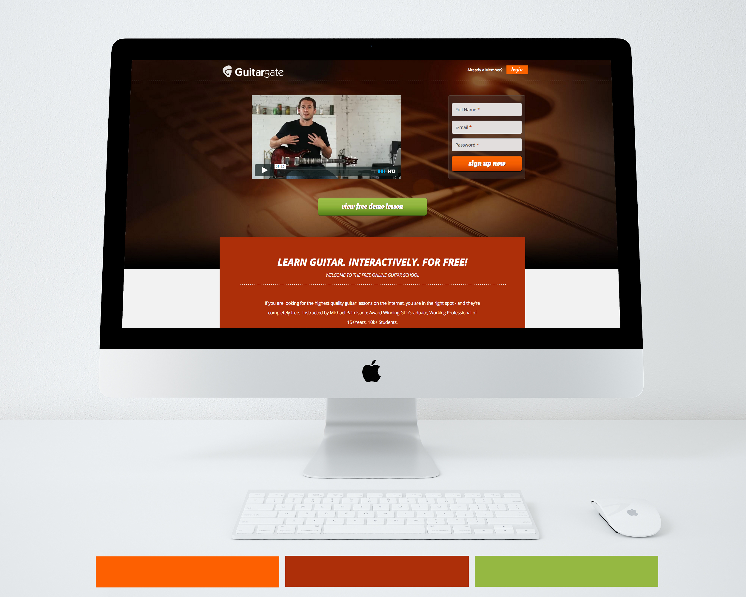
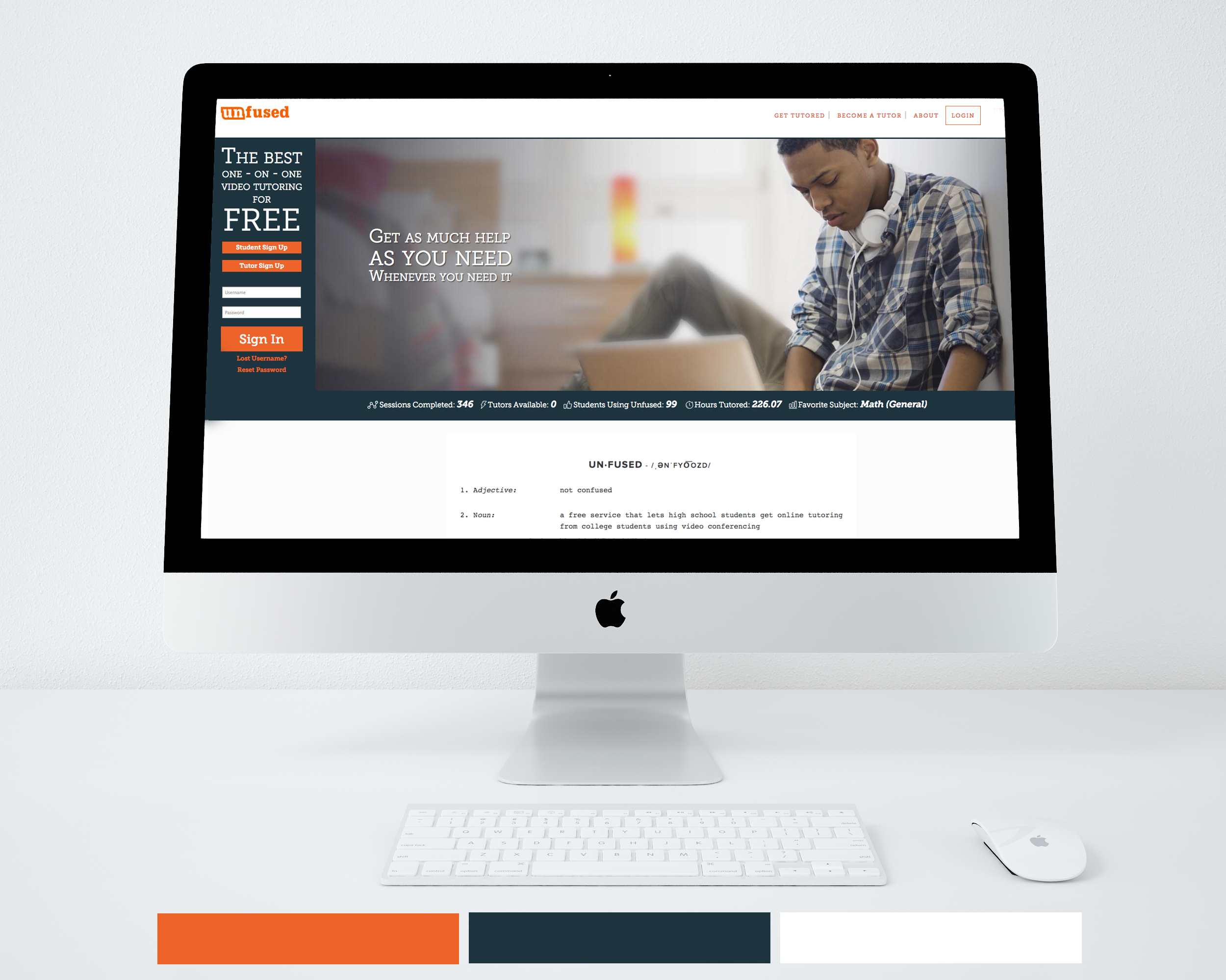
Red. Utilize the color red if your goal is to make your site characterize Urgency or Alertness.

Yellow. Feature yellow if your site will depict Friendliness or Excitement.

Common Mistakes in Applying Color Theory
Color theory can be misused just as easily as it can be mastered. Even the most beautiful designs fail when color choices lack purpose or structure.
Avoid these common mistakes:
- Using too many colors: A cluttered palette overwhelms users and weakens brand identity.
- Ignoring contrast and accessibility: Low contrast reduces readability and alienates users.
- Choosing colors based on preference, not purpose: Personal bias should never outweigh functionality or audience testing.
- Inconsistent usage across elements: Inconsistency dilutes brand cohesion and confuses users.
Great design is disciplined design — color should simplify, not complicate, the user experience.
Partnering with WDG for Strategic Web Design
Color theory is more than a design principle; it’s a strategic framework for creating websites that engage and perform. At WDG, we apply color intentionally — combining creativity, psychology, and data to craft digital experiences that resonate with audiences and align with brand goals.
Our team tests every palette for emotion, accessibility, and clarity, ensuring your website feels as good as it looks. Whether you’re refreshing your brand or planning a full redesign, WDG’s research-driven approach to color helps your digital presence stand out with purpose and precision. Contact us today to get started!
FAQs about Color Theory in Web Design
What is color theory in web design?
Color theory studies how colors interact and influence perception. In web design, it’s used to create harmony, reinforce branding, and guide user behavior.
Why is color theory critical in web development?
Color affects usability, readability, and accessibility — key factors in delivering inclusive, effective digital experiences.
How many colors should a website use?
Most designers recommend no more than three base colors, complemented by multiple shades or tones for variety.
Which colors convert best for calls-to-action?
Bright, warm colors like red, yellow, orange, and green often perform best, depending on brand context and audience preferences.
Can WDG help create a color strategy for my website?
Yes. WDG’s designers use color theory to build research-based palettes that reflect your brand personality, engage your audience, and optimize user experience.
Related Insights