Design Principles for Nonprofits (and 5 Who Got It Right)
In today’s digital-first world, a nonprofit’s website is often the first and most important touchpoint between its mission and potential supporters. It’s more than a brochure; it’s a storytelling platform, fundraising engine, and a space to build trust.
For nonprofits, good design is about more than aesthetics. It’s about creating experiences that communicate purpose, spark emotion, and make it easy for people to get involved. Whether you’re seeking donations, volunteers, or awareness, your website needs to be intuitive, emotional, and impact-driven.
Below are five design principles that help nonprofits achieve those goals—along with five real examples of organizations that got it right.
Key Takeaways
- Nonprofit website design should balance storytelling with usability.
- Impact-focused design shows visitors how their support makes a difference.
- Visual storytelling turns empathy into action.
- Great design partners understand your mission as deeply as your team does.
- Prioritizing user experience increases engagement and conversions.
1. Be Impact-Oriented
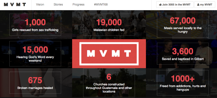
When visitors land on your site, they want to know one thing right away: “What impact does this organization make?” Leading with your mission’s outcomes builds credibility and connects users to your purpose immediately.
Being impact-oriented means putting measurable results and human stories at the forefront. Use visual data—like bold numbers, infographics, or icons—to show progress. Support those visuals with concise, emotionally grounded copy that connects data to real-world change.
Example: MVMT greets visitors with statistics that show exactly how their actions have made a difference. Instead of long paragraphs about goals or philosophy, the homepage leads with results—helping users feel their involvement is part of something tangible.
When nonprofits make their impact easy to see, supporters feel inspired to contribute—and confident their donations matter.
Related: Reasons to Refresh Your Non-Profit Site
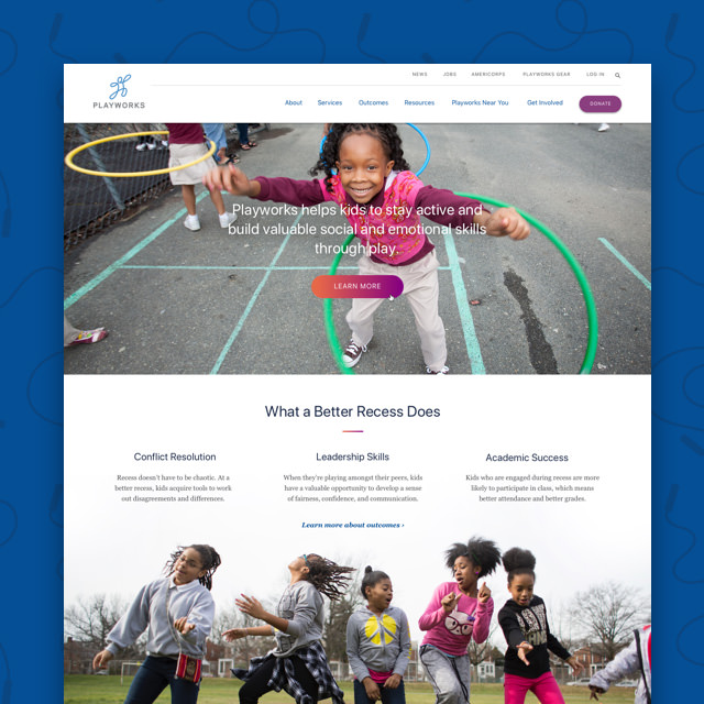
2. Tell Your Story with Visuals
Nonprofits have the advantage of deeply human missions. The key is communicating that mission in a way that inspires empathy and action. Visual storytelling transforms statistics into emotional connections, showing visitors why your work matters.
Start with authentic photography—images of real people, communities, or outcomes that reflect your mission. Pair those visuals with concise copy that highlights emotion and hope. Build your page as a story: lead with the challenge, introduce the people affected, and close with the difference your organization makes.
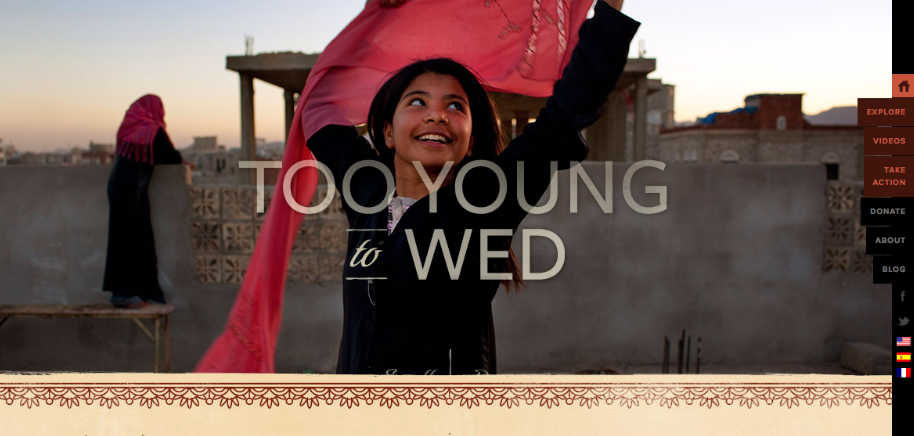
Example: Too Young to Wed uses powerful imagery and quotes to draw attention to the individuals impacted by child and forced marriage. As visitors scroll, they see both the problem and the progress—creating an emotional arc that compels them to act.
Visual storytelling helps users not just understand your mission—but feel it. And that’s what moves them to give, volunteer, or share your message.
3. Balance Emotion with Clarity
Emotion is the heartbeat of nonprofit storytelling, but it needs balance. Too many animations, colors, or competing visuals can distract from your message or slow down performance. Effective nonprofit design combines empathy with simplicity, guiding attention where it matters most.
Keep layouts clean and navigation intuitive. Use whitespace to frame imagery and let important messages breathe. Ensure calls-to-action (like “Donate” or “Get Involved”) are visible, clear, and consistent.
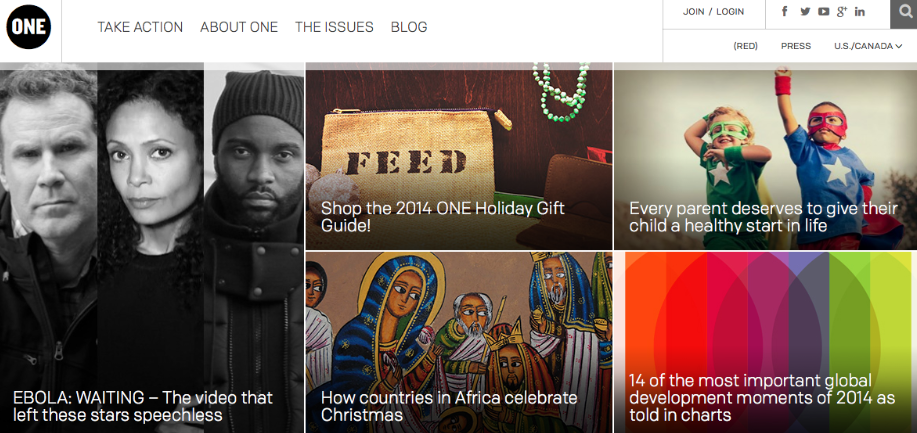
Example: One, the global campaign to end poverty and preventable disease, uses impactful photography with bold, simple typography. The visuals set an emotional tone, but the site’s structure keeps focus on their mission and engagement opportunities.
Clarity doesn’t dilute emotion—it amplifies it by giving it space. When users can process your message easily, they’re more likely to act on it.
4. Work with Partners Who Understand Your Mission
A nonprofit website is most successful when it’s built by people who understand both design and purpose. The right agency partnership ensures your mission translates into visuals, navigation, and content that genuinely reflect your organization’s values.
Look for collaborators who prioritize communication and alignment over production speed. A mission-aligned agency can help your team identify the emotional throughline of your brand, build accessible experiences, and create donation workflows that convert.
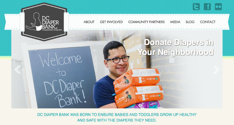
Example: At Web Development Group (WDG), our GiveBack DC initiative offers free website services to nonprofits throughout the D.C. area. Since 2012, we’ve helped organizations like DC Diaper Bank expand their digital reach and community impact through strategic, user-first design.
When your design team shares your passion, every pixel becomes a reflection of your mission—not just a page on a website.
5. Prioritize User Experience (UX)
Even the most beautiful nonprofit website won’t succeed if users can’t navigate it easily. Good UX ensures that every interaction—whether reading a story, finding resources, or making a donation—is intuitive and frustration-free.
Strong user experience begins with clarity and empathy. Simplify navigation so visitors can find what they need without effort. Streamline donation flows by reducing steps and distractions. Optimize for mobile, since many users now give directly from their phones.
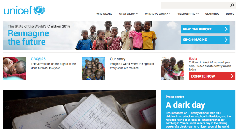
A UX Magazine study compared UNICEF and The American Red Cross, revealing how intuitive design directly affects conversion rates. Interestingly, Red Cross had a less user-friendly desktop experience but later improved its mobile donation system—boosting engagement through simplified UX.
When nonprofits prioritize user experience, they remove friction from generosity—turning intention into impact.
Common Nonprofit Design Mistakes to Avoid
Even with good intentions, many nonprofits fall into design traps that weaken their online presence. Avoid these common pitfalls to keep your site both beautiful and functional:
- Neglecting accessibility: Every user should be able to engage with your content, regardless of ability.
- Overloading pages: Too much copy or imagery makes navigation overwhelming.
- Using generic stock photos: Authentic visuals build trust; staged images erode it.
- Ignoring mobile usability: Donation forms and navigation must work flawlessly on phones.
- Skipping user testing: Real feedback identifies issues before they affect donors.
Small details can make or break trust online. Investing in accessibility, clarity, and authenticity ensures your design strengthens credibility instead of undermining it.
Why Great Design Matters for Nonprofits
Your website isn’t just a digital storefront—it’s an extension of your mission. Every interaction tells supporters who you are and why they should believe in your cause.
A great nonprofit website:
- Builds trust through transparent communication and consistency.
- Improves fundraising by simplifying donation paths.
- Creates community by celebrating impact and human connection.
In short, great design doesn’t just make your nonprofit look good—it helps your mission thrive.
Related: Web Development for Non-Profits
Building Purpose-Driven Nonprofit Websites with WDG
At Web Development Group (WDG), we know that design for nonprofits is about more than aesthetics—it’s about impact. Our team helps mission-driven organizations create user-first websites that inspire action, improve accessibility, and scale over time.
We combine technical expertise with strategic empathy, ensuring that each design reflects the organization’s goals and values. Through initiatives like GiveBack DC, we’ve partnered with dozens of nonprofits to provide the same high-caliber design and development used by global brands.
If your organization is ready to build a website that amplifies your message and strengthens community engagement, WDG can help you design for impact. Contact us today to get started!
FAQs about Nonprofit Web Design
What makes nonprofit website design unique?
Nonprofit websites must inspire emotion, build credibility, and drive engagement—all while making it easy for users to take action.
How does design influence donations?
Clear UX, visual storytelling, and transparent impact metrics increase trust and motivate users to give.
What’s the most important design principle for nonprofits?
Empathy. Understanding your audience’s motivations helps you communicate meaningfully and authentically.
How often should nonprofits update their websites?
Every 3–5 years or as technology, branding, or fundraising strategies evolve.
Why is accessibility important?
Accessibility ensures everyone—regardless of ability—can experience your mission, reinforcing inclusivity and trust.
Related Insights