The Phillips Collection


The Phillips Collection mobile strategy
The Phillips Collection, America’s “first museum of modern art”, came to WDG in search of a user-centric solution for their visitors both online and in person. The collection features modern and contemporary art and promotes innovation, engagement, scholarship, public participation and creative collaboration of artists.
Drupal and WordPress Versatility
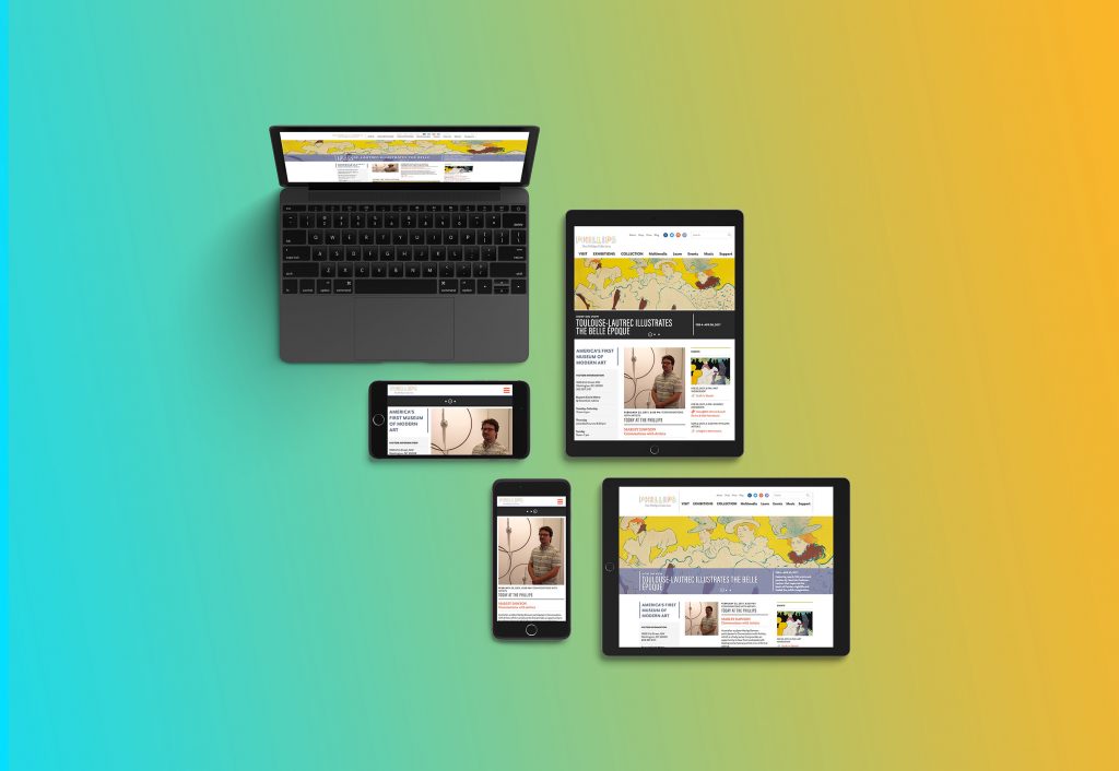
With the projection that 50% of all internet traffic will soon be mobile, the Phillips Collection understands the importance of an impactful, mobile-friendly website. Partnering with WDG, the Phillips Collection was aided in establishing a mobile-responsive experience.The challenge became more intricate with WDG showcasing their development versatility while working within the museum’s Drupal website and WordPress blog simultaneously. Our team worked closely in collaboration with the collection’s creative director to create a mobile experience that hones in on attracting and engaging collection visitors.
Developing User Friendly Navigation
The project’s most significant objective was identified with the building of a functional mobile navigation. The Phillips Collection had a complex, multi-tiered information architecture, housing resources, activities, and other crucial information about the collection. Our developers built an intuitive system allowing users to be effortlessly guided to necessary information, no matter where they landed on the new mobile site.

Following A Mobile First Approach
WDG conducted a robust quality assurance process which tested the mobile site on multiple platforms. Images were adjusted to maintain high resolutions while keeping load times manageable.The Phillips Collection is now accessible on most smartphones and tablets. Our team tested platforms and browsers by using both physical devices and emulators.
The demand for mobile-friendly web content is higher than ever. Google has found that 52% of users are less likely to engage with a company if the site is not mobile friendly. Our team successfully evaluated a non-responsive website and deployed a fully mobile responsive, user-friendly site in a matter of weeks.
Creating An Equally Powerful Responsive Design
The Phillips Collection attracts visitors from all over the country. Because of its location in Washington, D.C., the collection desired a mobile experience catering to tourists who explore the capitol on their mobile devices. Our development team also restructured the home page which reformatted the desktop 3-column information structure to a single column following a predefined hierarchy. On a desktop, the middle column holds the most weight in a 3-column layout. In order to prevent HTML restructuring, the middle column needed to appear first on mobile. The team used the CSS3 flexbox which allowed them to override the natural left to right, top to bottom structure of the HTML.
Now, mobile users experience tailored, relevant information first. The end result is a responsive and adaptive mobile experience.
Time is of the essence, consult with us to revamp your digital presence. Let us help you with your success.