Rebirth of “the scroll”

If there’s one thing that is for certain in website design, it’s that nothing stays the same for too long. What was once trending, or taboo, a year, or even six months ago, might be completely outdated today. Case in point: the resurrection of “the scroll.”
Just a few years ago, website designers constantly felt the pressure to design “above the fold,” or in the visible area of the screen that could be viewed without scrolling down. But today, “the scroll,” has been reborn! Why, you ask. The answer is simple: mobile.
Web browsing on a mobile device now surpasses that of desktop browsing, and so, website and User Interface designers have had to change their tune to accommodate the increasingly widening gap in mobile vs desktop browsing. With so many users using tablets and smartphones, scrolling is unavoidable, and swiftly becoming a necessity. And the smaller the screen, the longer the scroll. Further, as access to high-speed internet and Wi-Fi becomes easier and more prevalent, scrolling has become the faster way to access information, opposed to clicking between pages.
Coming in as a close second as the catalyst behind the rebirth of the scroll is social media. The most popular social media sites like Facebook and Twitter utilize a scrolling feed layout, on both desktop and mobile. And with 2.3 billion active social media users throughout the globe, it is no wonder that UI is influenced by the popularity of such sites, as users have become accustomed to scrolling in order to generate content.
And we can’t leave out our friends CSS and Javascript. They’re not exactly new kids on the block, but as UI designers find fresh and unique ways to utilize their powers, they develop more interesting and attention-grabbing visual storytelling techniques. So scrolling no longer means chipping away at a long page of text, broken up with a few images here and there. But now, implementing animation, graphics, icons and videos creates a much more compelling UI layout, approaching infinite scroll as a way to present a beginning, middle and end to a web page.
So is “scroll” design the right fit for you? Well first, let’s outline the benefits and drawbacks, because like everything else, there are advantages and disadvantages to utilizing this design technique.
Advantages:
- Encourages interaction – When you have no choice but to scroll to generate content, user interaction increases tenfold
- Faster – Time is money, and scrolling is faster than clicking through an intricate navigation path
- Easy – Interactivity and an increase in the time viewers spend on a site are just a few of the benefits of implementing the user-friendly scroll
- Adaptive design – As viewers visit your page from so many different platforms, with so many different screen sizes, designing with a long scroll will help keep the experience agnostic between devices
- Natural interface – Research is finding that scrolling seems organically linked with touch, and swiping is much easier than repeated taps or clicks on different areas of the screen. As mobile use (on touchscreen devices) increases, users naturally accept scrolling as a way to access more information
Disadvantages
- SEO drawbacks – Scrolling limits the number of unique pages on your site, and having fewer pages may have a negative effect on your site’s SEO, as Google and other search engines amend site scoring for the trend
- Navigational awkwardness – If you utilize a scrolling layout, it’s important to incorporate intuitive navigation, as it can be frustrating to scroll all the way back up a page to access the mega menu or back button
- Site Speed – Scrolling UI designs often incorporate large pieces of content such as video or image galleries on one page, which may slow down the site speed
- Lack of a footer – Unless your design also incorporates a sticky footer, users could scroll and scroll and never see your footer, which ultimately has important information that you want your site viewers to be able to see and easily access for further navigation, contact information and social sharing options
In addition to weighing the advantages and disadvantages when deciding whether or not to use the so called “infinite scroll,” you must also consider your goals and the content of your site. Traditional, shorter pages are typically better suited for goal-oriented or e-commerce sites, whereas social media sites or sites where new, extensive content is regularly generated, fare best with a long scroll.
If you have gotten this far and have determined that the infinite, or long scroll, might be right for you, we have summarized the Web Design Trends 2015 & 2016, and comprised some tips for successfully implementing long scrolling. It’s still relatively new to the realm of design, with around four years of substantial data, but some rudimentary trial-and-error has produced good fundamentals for best long scroll practices, which we present here.
- Mix and match. It’s okay to utilize both long and traditional short scroll on your site, just let the individual page content dictate the scroll length, never vise versa. Currently, it’s pretty popular to have a short-scroll homepage and long-scroll supplementary and landing pages.
- If you’re nervous about how users will navigate throughout your site, using sticky navigation will help. This allow users to return quickly or bounce easily from element to element, page to page, etc. within in the scroll.
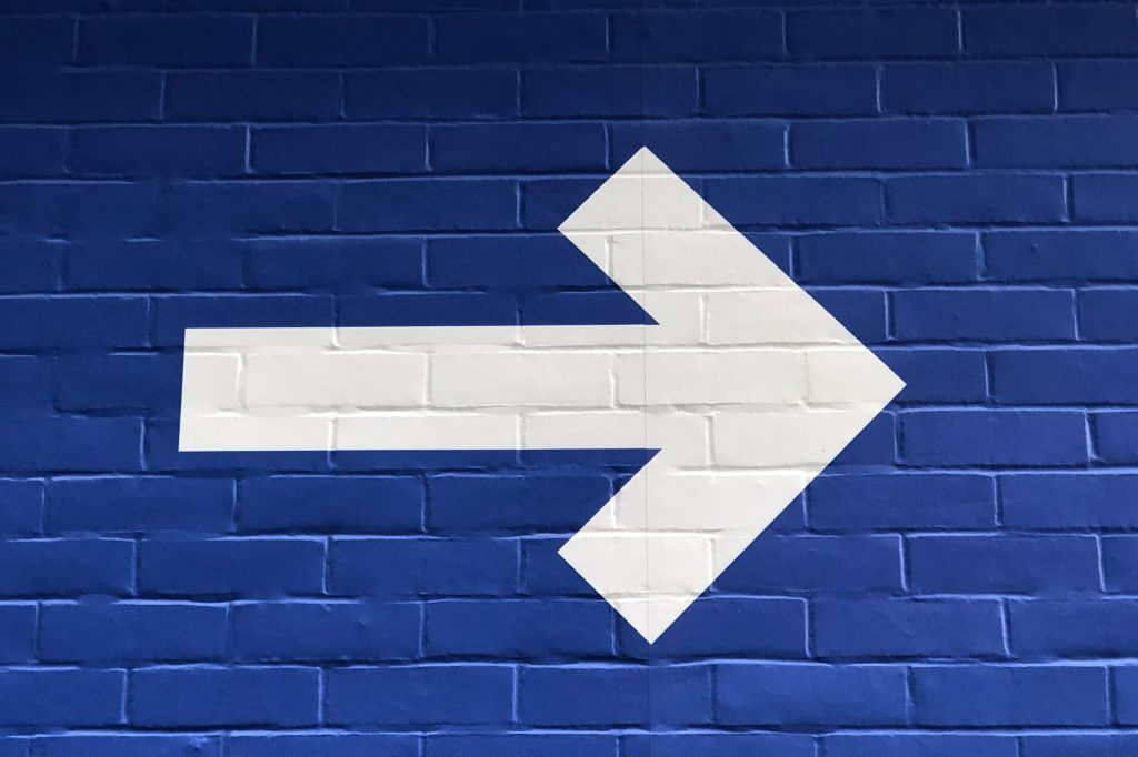
- Utilize intuitive navigation “suggestion” elements or tools, so user can quickly see how the site navigation works. Visual cues such as arrows, animated buttons or similar user interface tools are an interactive way to help the viewer easily determine what to do or where to go next.
- Make clear distinctions between scrolling navigation and other calls to actions
- Less is more. Long scroll doesn’t mean compressing 500 pages of continuous content into one long super site. Infinite scrolls don’t have to literally be infinite: once you’ve told your story and covered all your bases, it’s time to stop, even if the scroll is equivalent to a few pages long. Don’t force it.
- Incorporate visual cues that will help orient viewers and indicate their position within the scroll. As accustomed to long scrolls as viewers are becoming, we still like to know that there is a light at the end of the tunnel, or how long we can expect to be scrolling down a page.
Like what we have to say? Check out more from our blog, or, drop us a line and get a project started at [email protected]