What Video Games Teach About Design: Progressive Enhancement

Before the advent of responsive web design, games were being designed to multitudes of screen sizes and varying platforms. If you bought a video game today, the core experience is 100% preserved whether you’re using a 22” monitor or a 65” mega-television.
True, there’s a better visual experience with a better screen. But the same content is always delivered and the core functions aren’t compromised—they enhance progressively through upscaling!
How is Progressive Enhancement Possible?
Game interfaces, like responsive sites, are built to adjust for the methods they’re being outputted for and the devices rendering them. Developers have to be very conscious of how elements on screen appear on the largest and smallest ends. If you have large elements, what will happen if shrunken? The same questions need to be considered for websites. Constantly check your visual solutions work in the least visually-ideal setups.
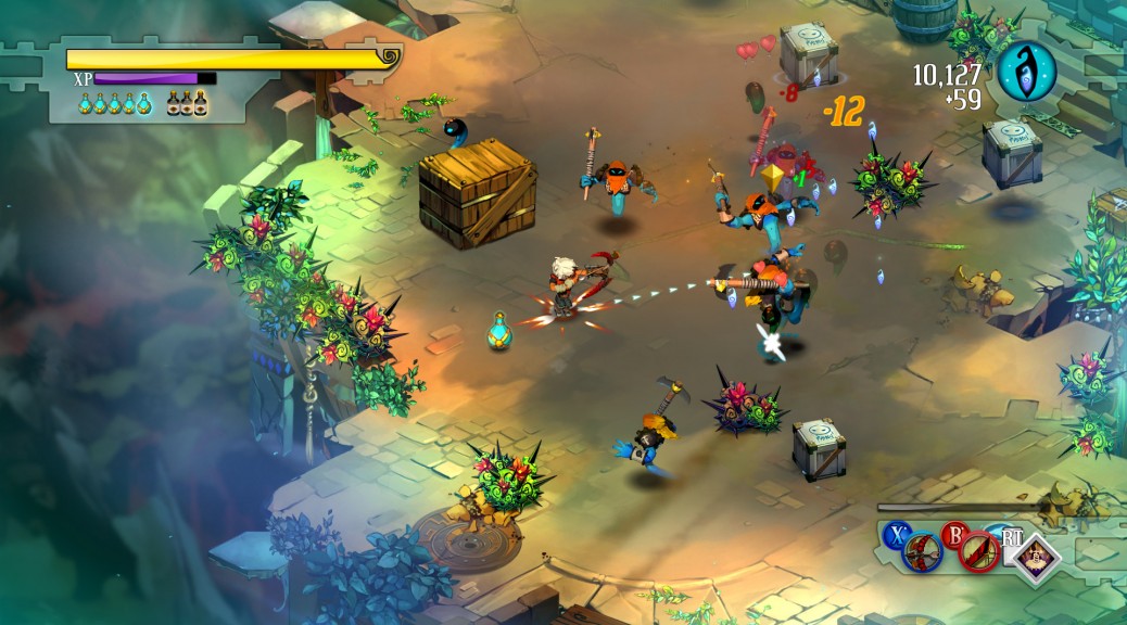
Bastion is a video game that demonstrates progressive enhancement very well. Bastion is a narrative-driven, action role-playing game with releases on PC, PS4, XBOX 360, OSX, and even iOS. The developer Supergiant Games took a formula initially built to function on a console, and successfully compacted and modified it so the core experience remained. Bastion can be played on just about any major device, highly increasing its visibility in the marketplace.
vs.
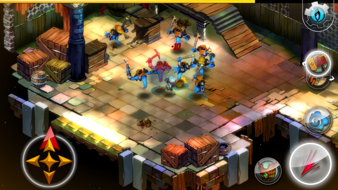
On first glance, you can identify what elements have been modified. But most importantly, you might notice the action on screen is still the focal point,even at 3.5 inches of screen real estate. When scaling down for a mobile interface, the game’s developers were extremely conscious of only displaying the most pertinent information, and accounted for how a player would input a variety of actions that previously had dedicated buttons in a console setting.
The result is an experience that is just as fun and playable—if not more so—as its console version.
Give Me a Practical Example of Progressive Enhancement on the Web
When building responsive sites, one of the biggest challenges is making sure that all necessary information is accounted for, even as the screen scales downwards. Every action a user can take on a desktop should be just as easily accomplished on a phone.
Sometimes to preserve the experience, new systems need to be implemented, like menus.
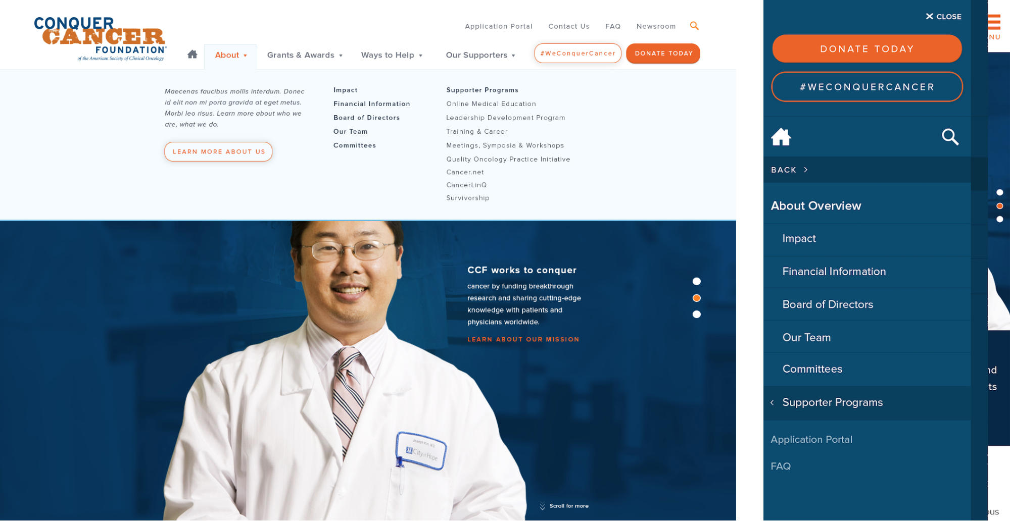
For the majority of a site, conversion to mobile is relatively straightforward: elements stack vertically below one another. Menus, on the other hand, typically need to be rethought. Take the example above. One of our clients needed to offer users access to dozens of links in as little taps as possible.
You can see how we made visual adjustments from the desktop version so the user can see what items have more links below. We also included an accompanying visual to indicate how many layers deep they’ve navigated, while minimizing the need to scroll excessively.
Which brings us back to the main point: keeping the experience consistent. Whether you’re playing a great game or viewing a great website, your choice of device should allow you experience it as best as possible without any compromise.
Interested in getting a web project started? With WDG, you’ll get a team of expert designers and developers who work with you to create uncompromised experiences. Get in touch! Or, do you want to talk about video games? Tweet at me!
WDG is located at 209 The Strand, Alexandria, VA 22314. We have also just opened a new WeWork location in Chinatown!