
Empowering Educators With Clear, Accessible Curriculum Reviews
EdReports
A Digital Resource to Help Shape Classrooms
Services
- UX Research & Heuristic Analyses
- Component Mapping & Wireframing
- UX/UI Design & Interactive Prototyping
- Stakeholder Workshops
- Strategic Consultations
Market
- Nonprofit
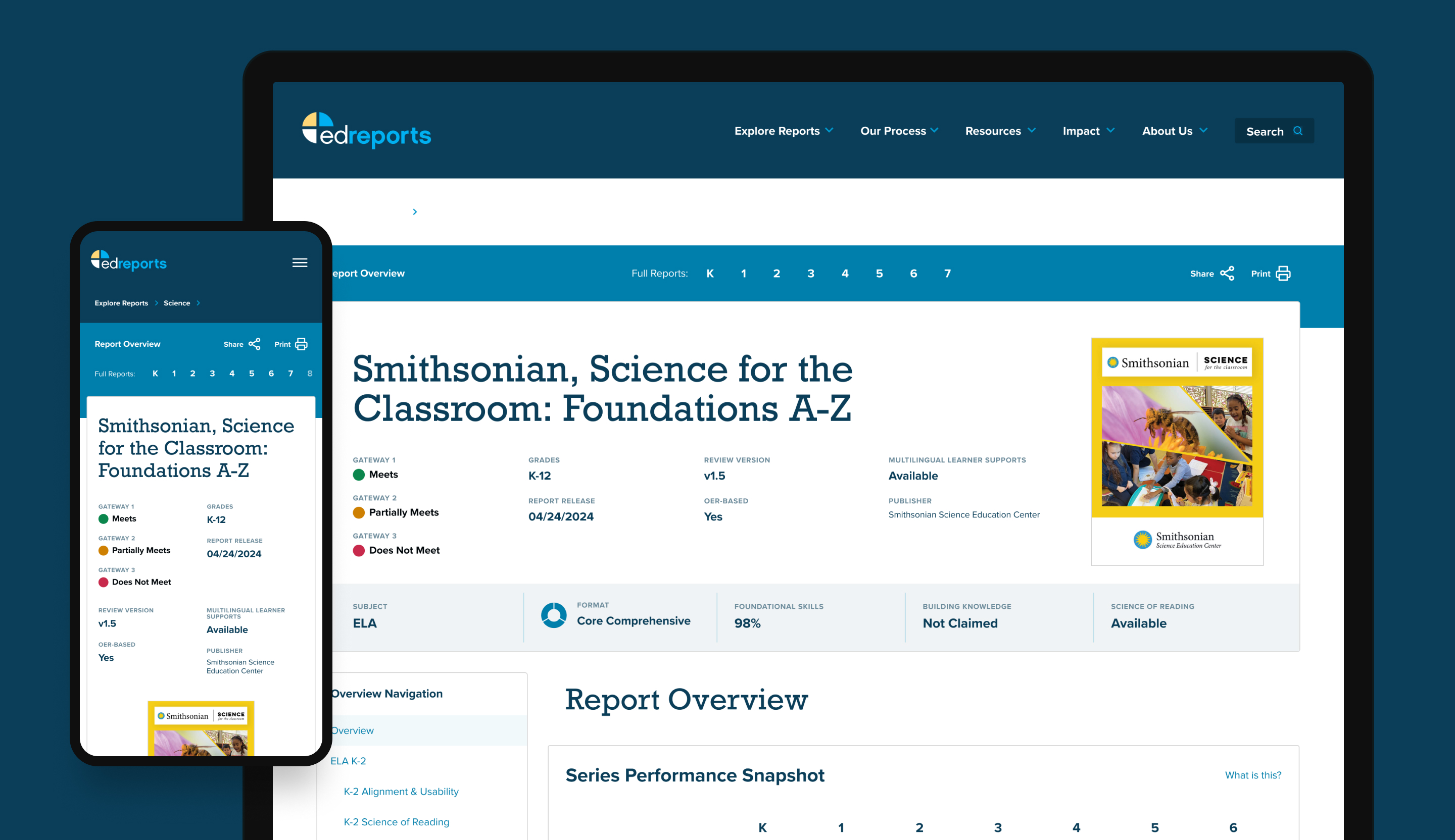
EdReports is a trusted voice in education and empowers school systems with evidence-rich reviews of K–12 instructional materials.
However, despite their essential role in curriculum adoption across the country, users weren’t finding or fully engaging with key features of their Reports Center, the very tool driving their influence.
Following a comprehensive UX audit, EdReports turned to WDG to modernize their Reports Center with a new user experience: one which could simplify complexity, encourage exploration and support long-term scalability while EdReports focused on expanding their offerings into new subjects and audiences.
The Challenge
Translating Complex Report Data Into a User-First Reporting Experience
EdReports’ internal audit highlighted major UX barriers: users struggled to locate core tools like the comparison functionality and filters, often feeling overwhelmed by dense content, and missing deeper insights within the actual reports. Additionally, their legacy CMS and component structure posed hurdles to scalability, a major issue given EdReports’ plans to scale beyond their areas of expertise in Math, ELA, and Science.
They needed a partner to help:
- Reimagine the user journey through their Reports Center,
- Design modular components to support evolving needs,
- Deliver scalable, responsive wireframes grounded in user research,
All without reinventing the voice of their brand or adding further complexity for EdReports’ internal content work processes.
The WDG Approach
Research-Driven Strategy. Collaborative Wireframing. Modular Design.
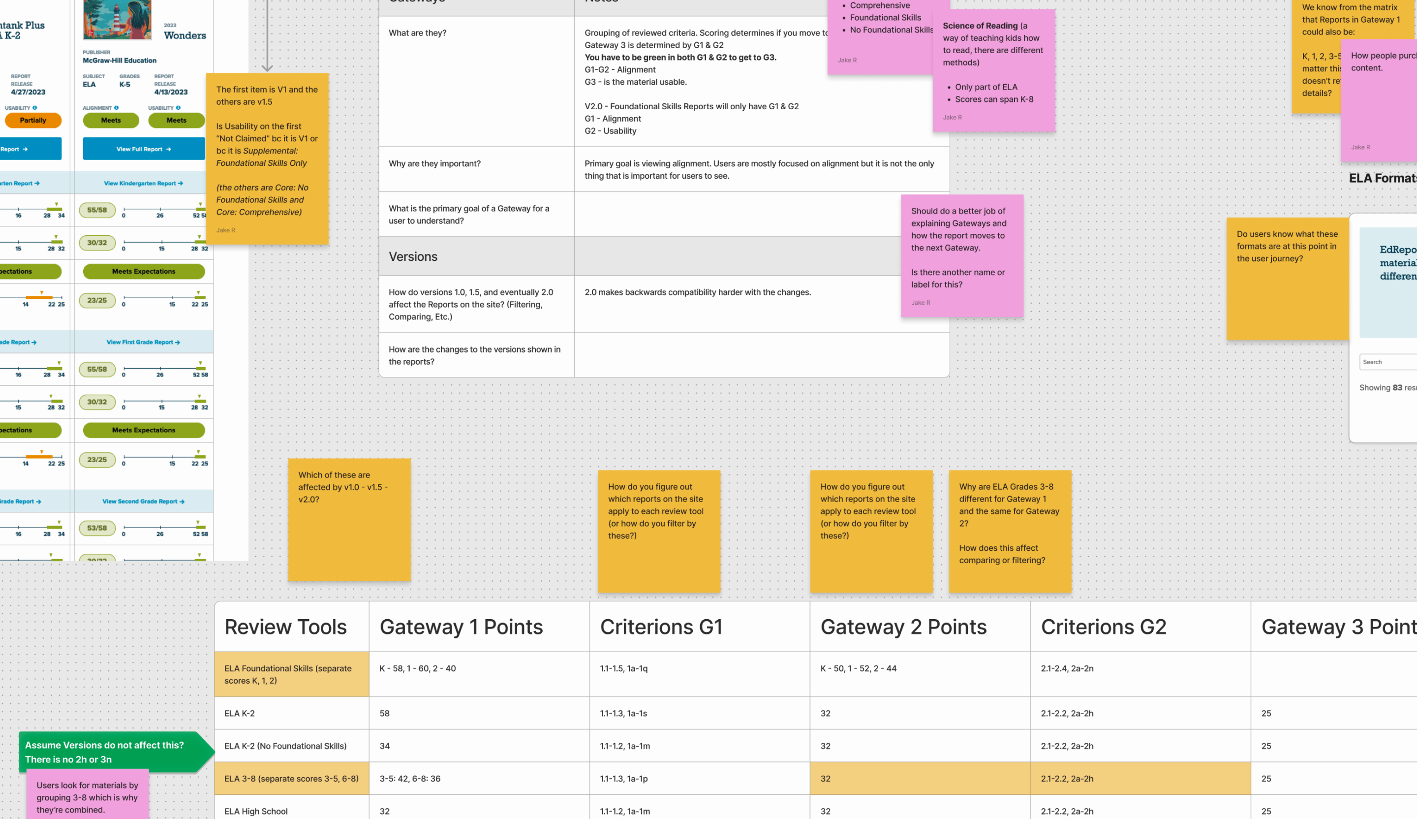
WDG began by immersing ourselves within the materials shared by EdReports, which included the UX audit and personas documentation. From there, we conducted a week-long heuristic evaluation of the Reports Center, identifying navigation gaps, filter inconsistencies, and information hierarchy issues across subjects, grades, and report versions.
We followed a phased approach:
Research & Discovery
- Reviewed EdReports’ internal audit, user personas, and site analytics
- Conducted heuristic and comparative analysis of existing report layouts
- Mapped component use across grades, subjects, and scoring criteria
Component Design
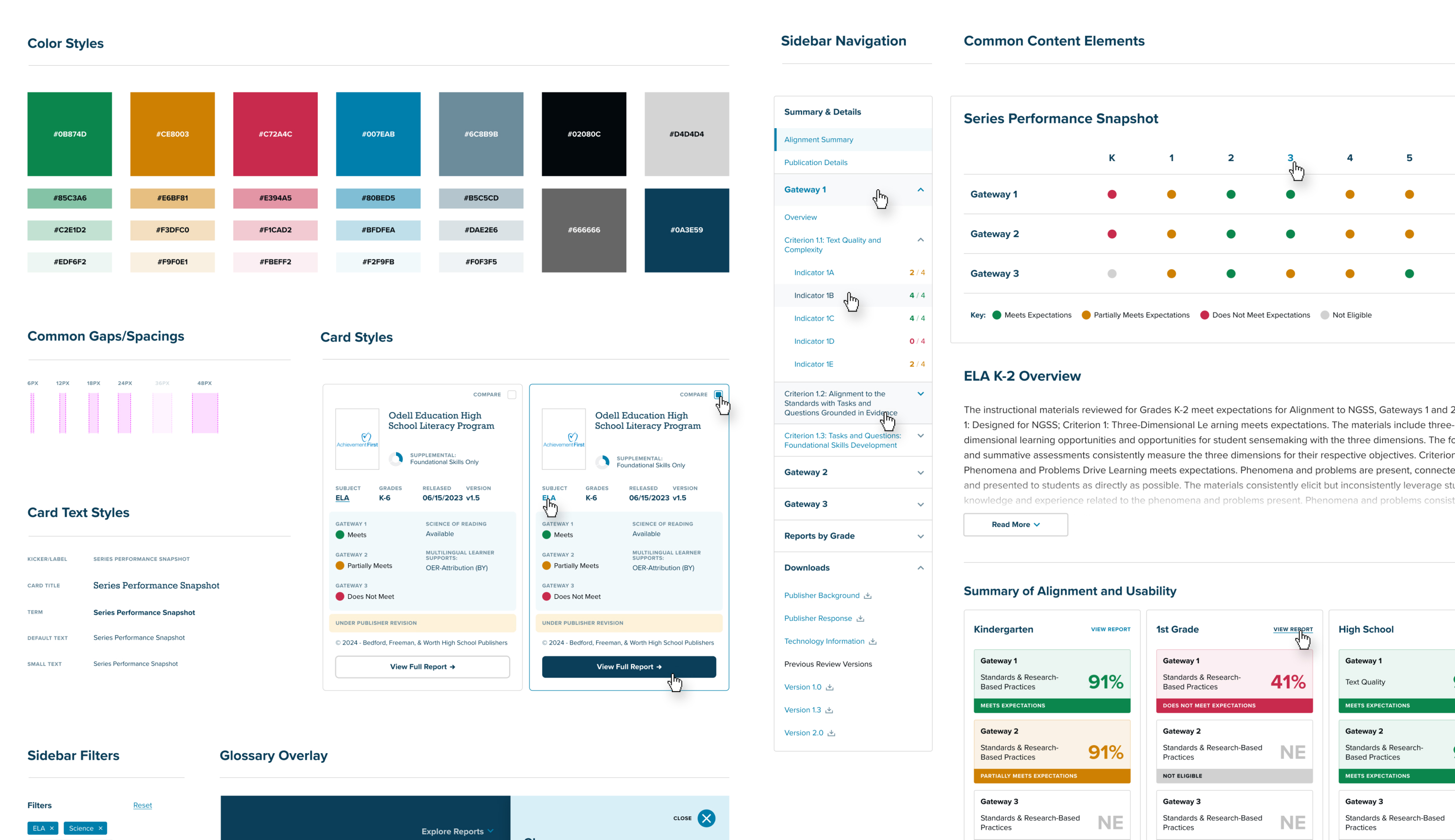
With the objective to support scalability, we developed an inventory of core interface components, each designed and validated using real report data:
- Filters and search UX
- Report headers and listing cards
- Gateway criterion tables and data visuals
- Side navigation for multi-grade reports
- Glossary tray with interlinked terms
Prototyping & Iteration
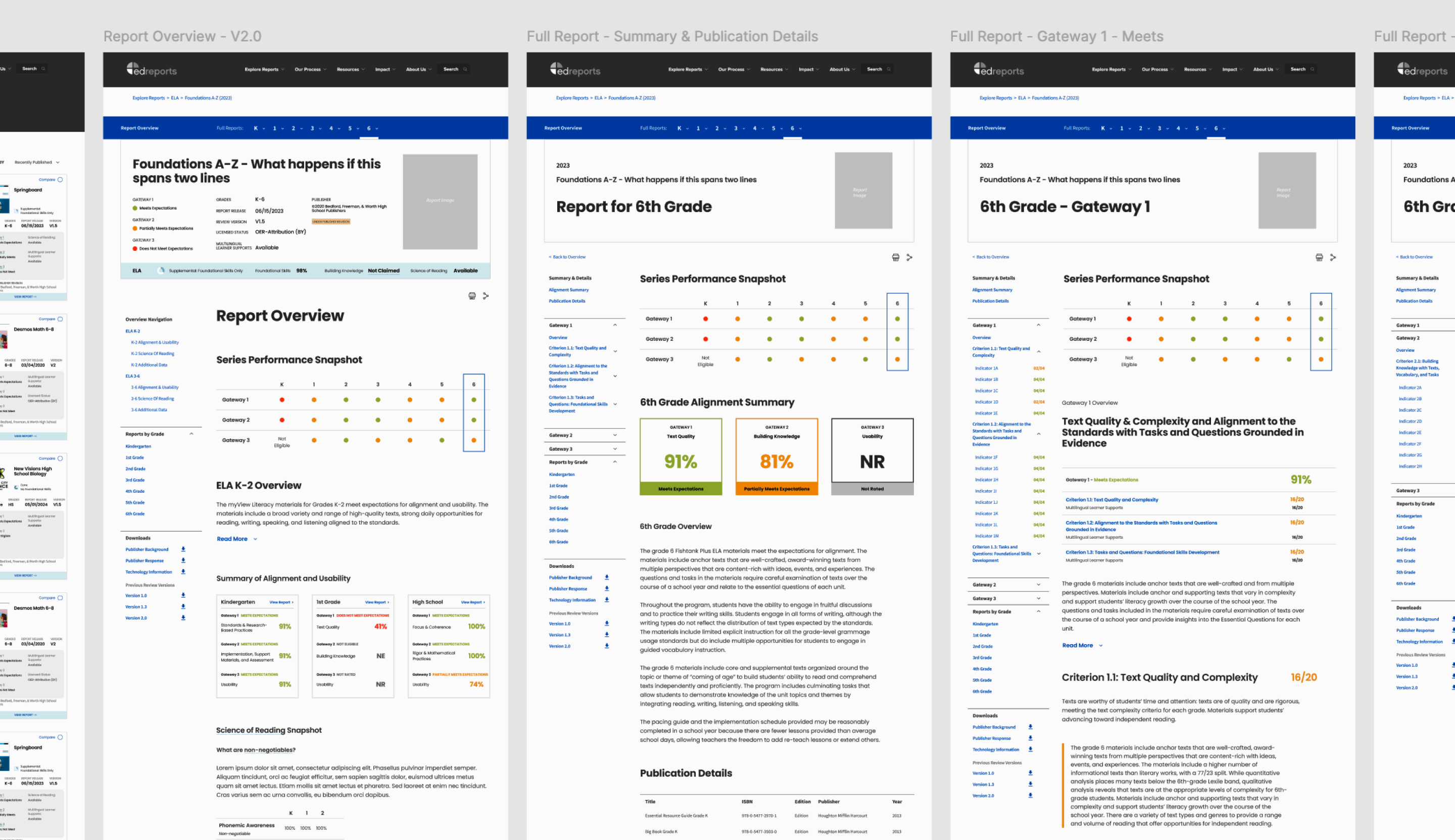
Using Figma, we built clickable wireframes in weekly cycles, walking EdReports stakeholders through scenarios that reflected actual user journeys. Each round incorporated feedback and included variations for desktop, tablet, and mobile.
Solutions in Action
Design Systems That Scale. Navigation To Support Discovery.
Our engagement resulted in a full system of wireframes and design recommendations, grounded in accessibility, flexibility, and strategic UX. Key enhancements included:
Glossary of Terms
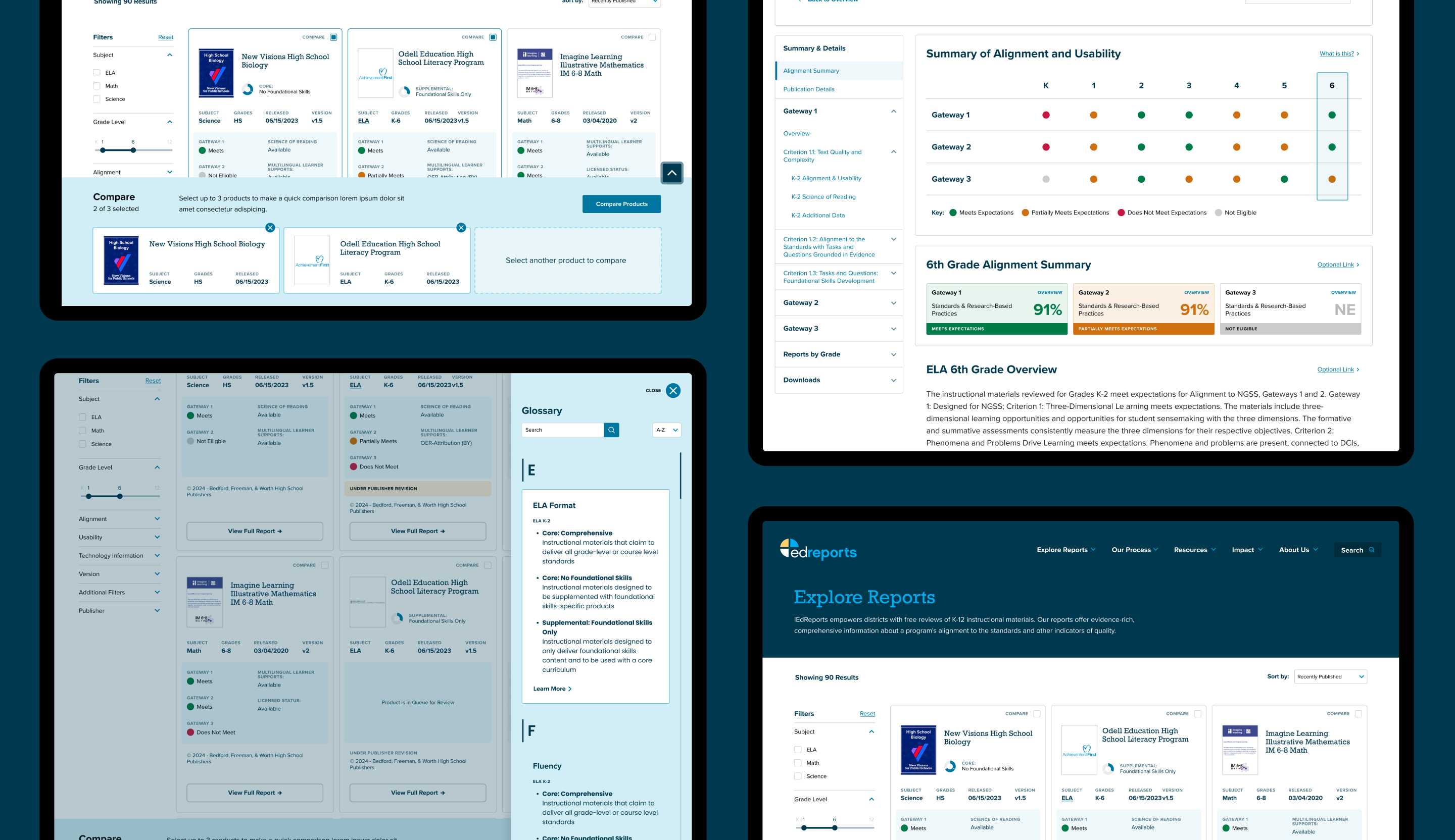
Instead of cluttered tooltips, we implemented a collapsible glossary tray that offers an organized, A–Z reference with cross-linking capabilities—improving mobile performance and cognitive ease.
Smarter Filtering
We simplified and separated dropdown categories to reduce confusion, ensuring filters update independently. Our deep understanding of EdReports’ data architecture enabled us to introduce filters that better align with how users explore.
Responsive Side Navigation
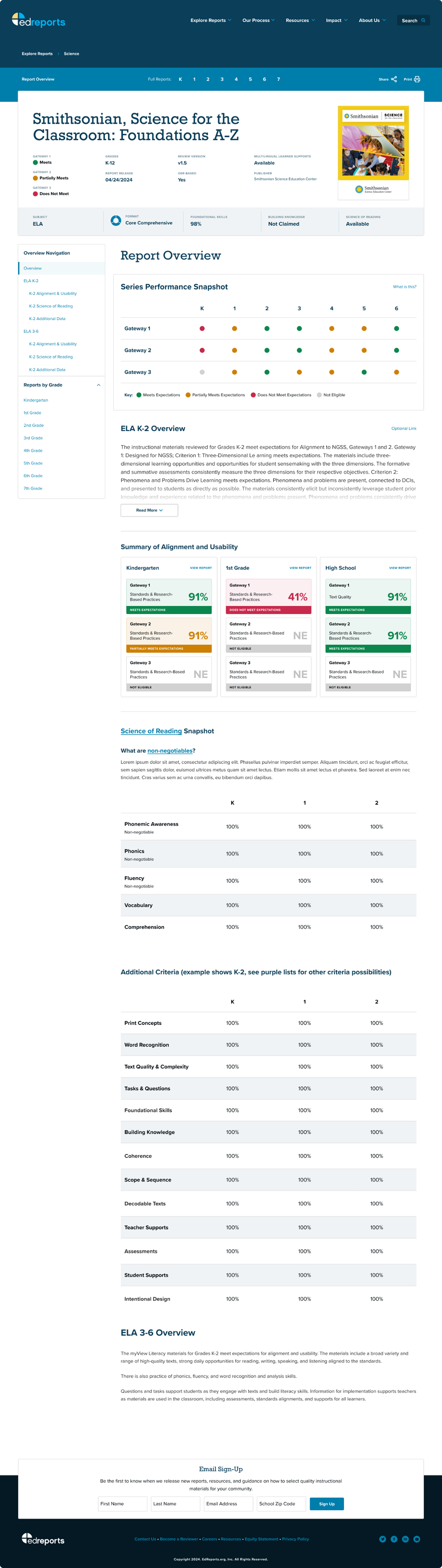
For both the Reports Center and individual reports, we introduced a persistent side navigation system that reflects where the user is in their journey—whether scanning summary snapshots or diving into grade-specific gateway criteria.
Card-Based Presentation
Content was restructured into digestible cards—tailored to different reading levels and attention spans. Hierarchies and color schemes were refined to better communicate performance and alignment.
Compare Tool Wireframes
We worked closely with EdReports to map out the parameters of a new comparison tool, ensuring like-for-like comparisons (e.g., within the same subject) and a layout that remains legible at scale.
The Impact
Laying The Foundation For Scalable Product Evolution
While the full system is still being rolled out by EdReports, several features—including the Glossary—have already launched. Thanks to our modular approach, their team can continue implementing updates without rework, even as new report versions or subject areas are introduced.
Importantly, this engagement established a design framework that supports:
- Ongoing user testing and iteration,
- Rapid onboarding of new subject matter areas,
- Internal efficiency for content authors and product teams.
Start a Project