Responsive Design is a Must for All Verticals

In today’s digital landscape, you don’t have to look too far to find different screen sizes that all have access to the Internet. Computers, tablets, and mobile phones: all can be great sources for online information, if they are designed the right way.
Whatever industry you work for, including responsive design into your website strategy is a crucial component of reaching your audiences. At WDG, we work with numerous verticals, from universities and associations to B2Bs and publications. While different verticals have different online goals to achieve, response design is essential for all.
Responsive Design for Branding
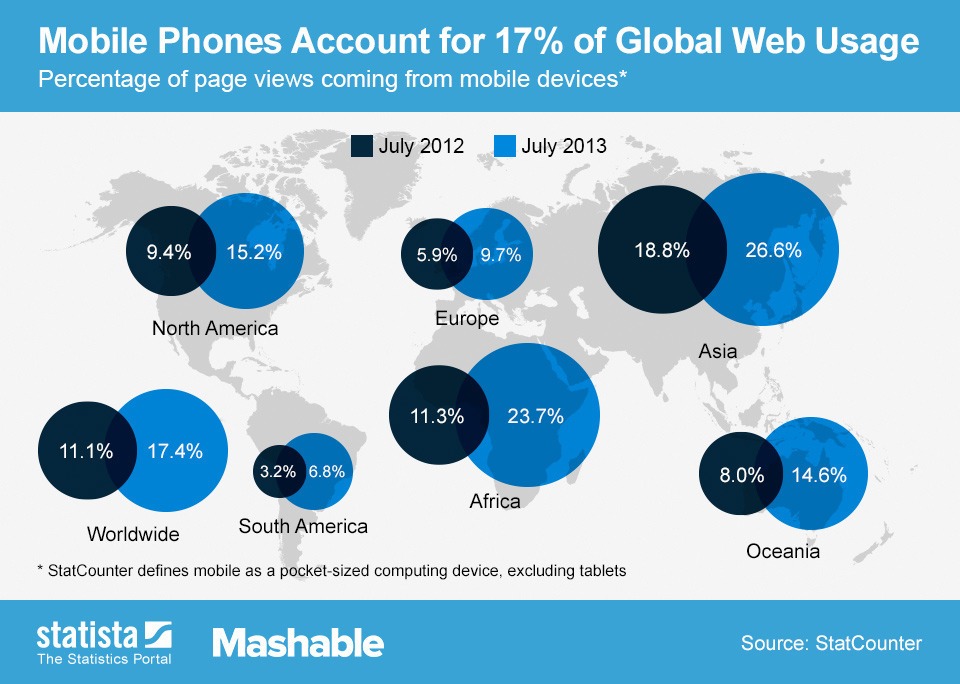
As of late 2013, over 17 percent of global web usage comes directly from mobile phones and that number is continuing to grow; gone are the days of focusing on One Size Fits All for your company’s digital presence. This leads us to the importance of incorporating responsive design into your devices.
To maximize your vertical’s digital impression, you have to consider the variance in screen size and how to market to your audiences through various gadgets with browsing capabilities. Utilizing responsive design is one of the most effective ways to cater to your users. Responsive design is an approach where design and development responds to the user’s behavior and environment based on screen size and device, using flexible grids and layouts.
When your site is responsive, your users will have a better experience with your brand, leading to some awesome benefits:
Google and Search Engines LOVE Responsive Sites
It’s hopefully a no-brainer that Google, and other search engines like it, favor responsive and mobile-oriented websites when providing search results. But did you also know that Google actually recommends that you stick with responsive design?
If your website isn’t responsive, then it probably requires maintenance of a desktop, tablet, and mobile site. This means several versions of content, which Google has some issues with. By having one responsive site, users can access the same content on any device and the look will stay seamless.
Higher Conversion Rates
If you utilize your website to sell services and products, responsive design is a must. It will provide a clear visual hierarchy that will guide your users directly to the particular call-to-action you want them to interact with, whether it’s signing up for a newsletter or buying an item. Starting with a mobile-first approach, you can design around the call-to-action and then progressively enhance the online experience as the screen size increases.
Avoid High Bounce Rates
Bounce rates are a metric that measures the number of visitors who enter a site and leave without viewing other pages in the site. Unresponsive sites can encourage high bounce rates, especially if the content on different devices strays too far from the desktop version. Why should this matter? Because high bounce rates are a sign to search engines that your site isn’t relevant, which means a lower ranking for your site on search results.
Working in multiple verticals, we craft dynamic digital solutions that are inventive and unique to your industry. Have any more questions about how responsive design can bolster your industry’s presence? Get in touch with us at WDG and learn how we can help strengthen your digital reach.